Pager Digital
Website, App & Dashboard
•••
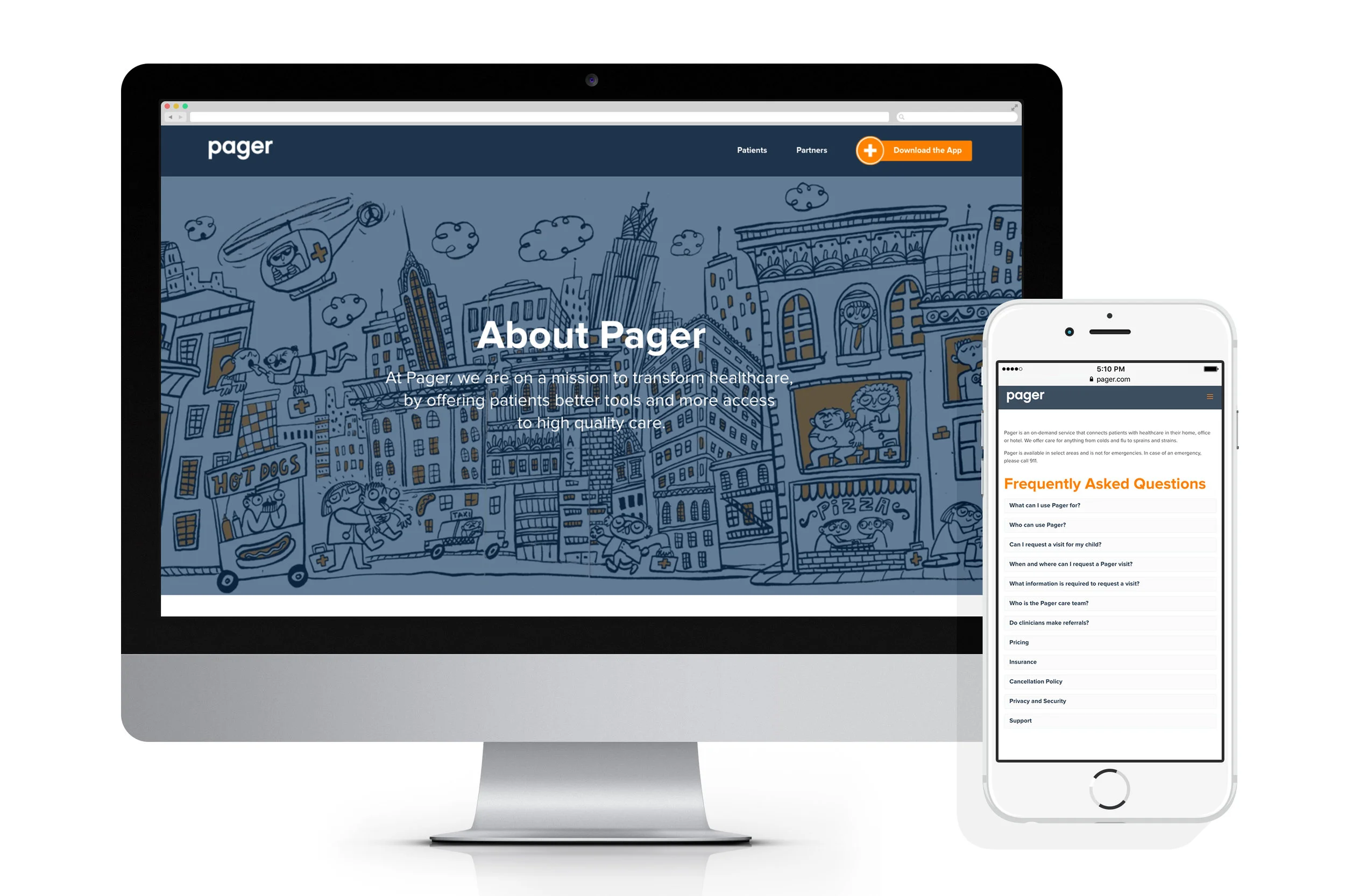
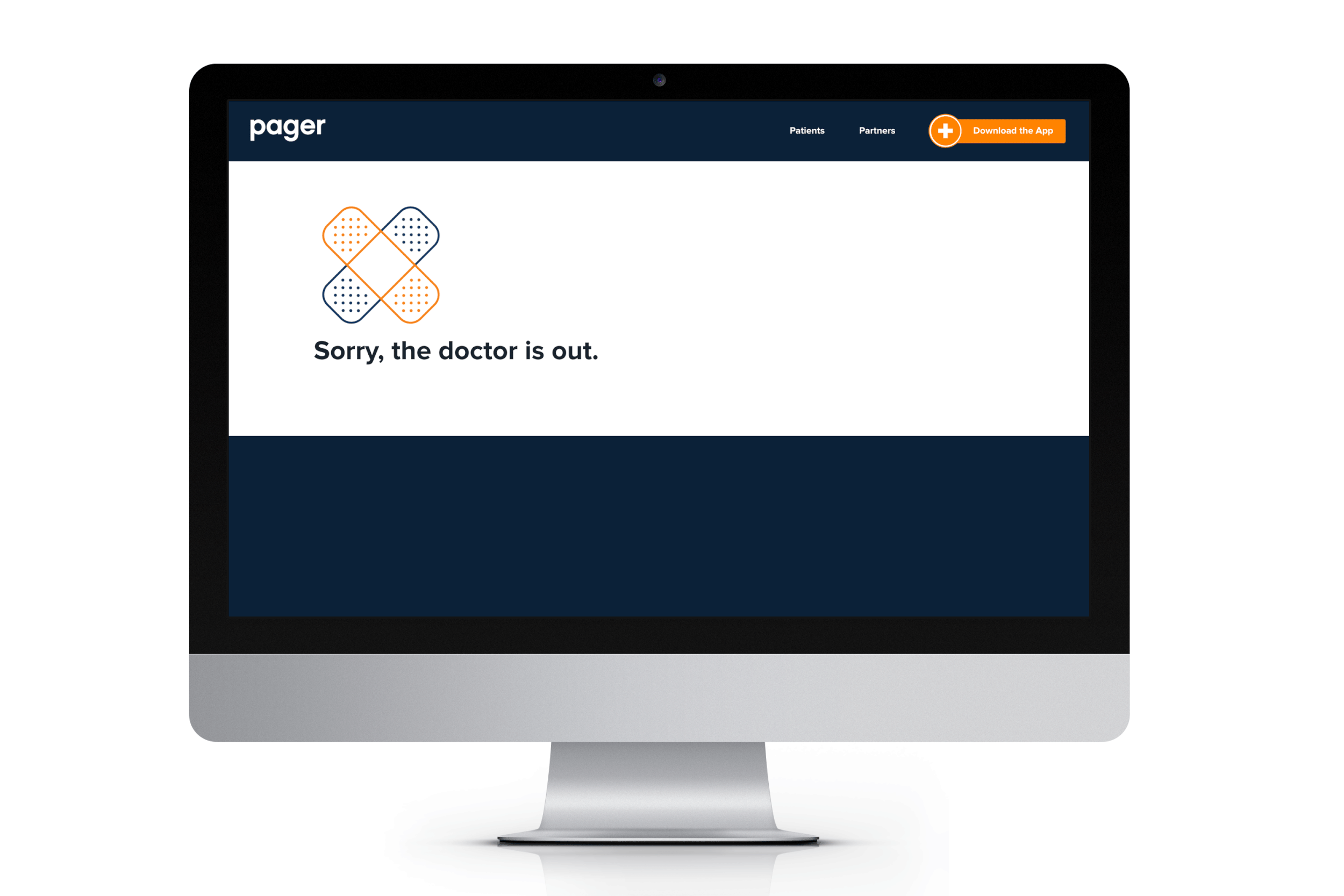
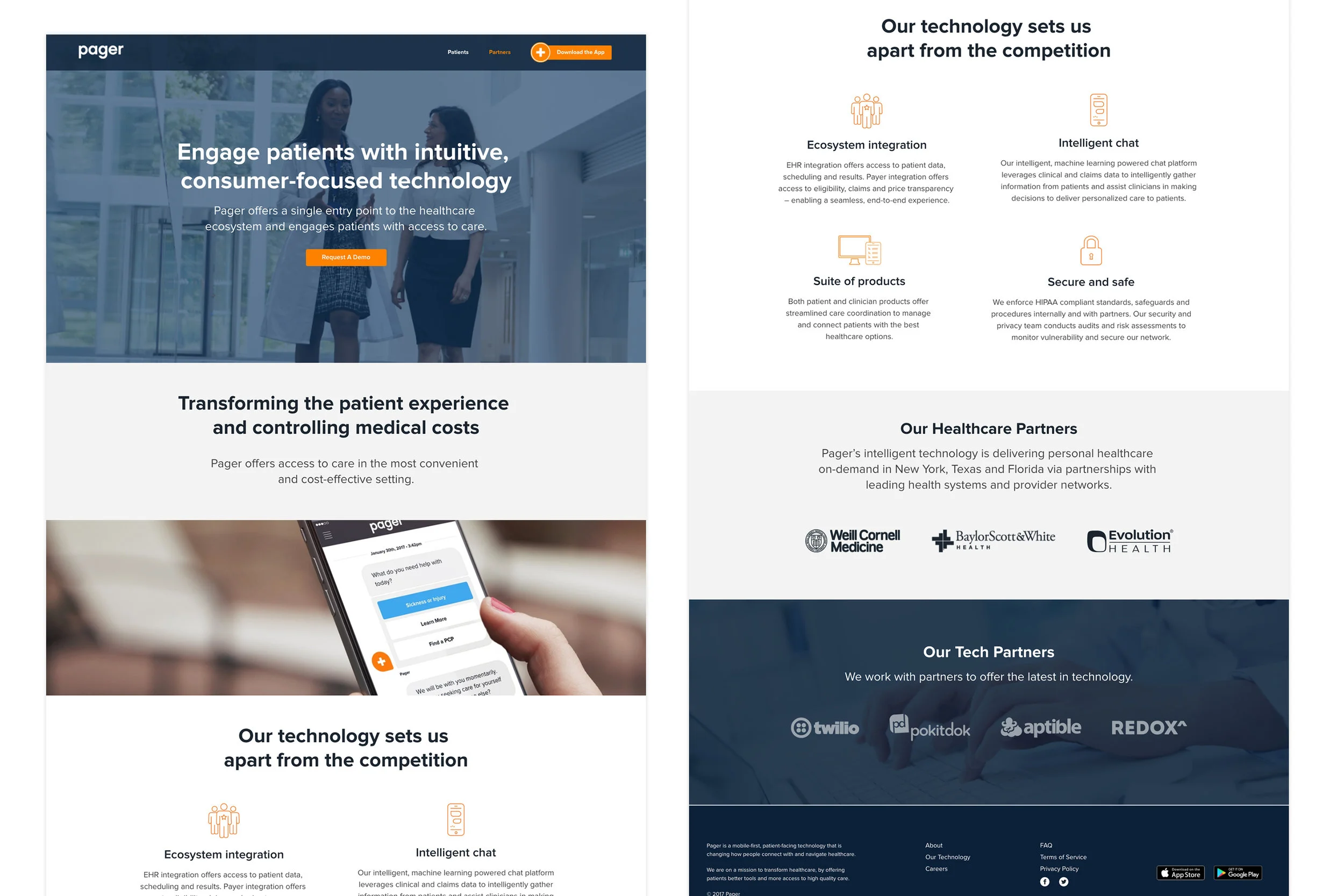
Pager Website
Project: Pager Website Redesign Role: Creative Director
Managed design, content and production for the Pager website redesign and digital assets.

Healthcare is complicated. Patients are overwhelmed. They don’t know where to turn and are skeptical that any product will be easy or helpful in their time of need. Pager should provide an easy, accessible and transparent experience to build trust and guide patients to the care they need.
By analyzing our users, competitors, common healthcare use cases and historical data within our product, we were able to better understand user needs and pain points. In turn, this helped us set our priorities to develop a roadmap and comprehensive journey.


••••••••••
Pager App
Project: Pager App Redesign Role: UX/UI Design Lead
Managed UX/UI, content, and production for the Pager app home screen redesign.
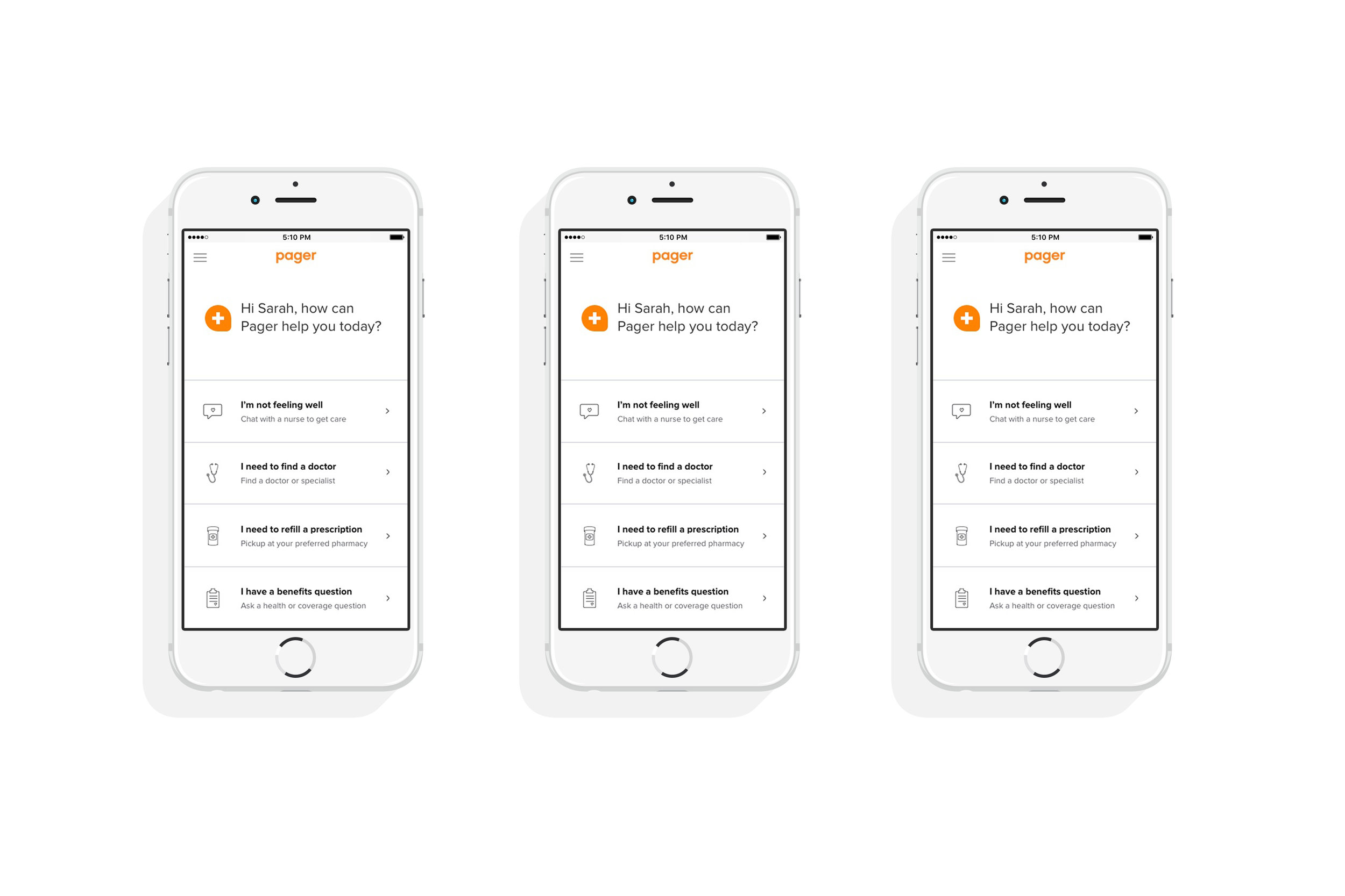
The Challenge
Healthcare is complicated. Patients are overwhelmed. They don’t know where to turn and are skeptical that any product will be easy or helpful in their time of need. Pager should provide an easy, accessible and transparent experience to build trust and guide patients to the care they need.
Research
By analyzing our users, competitors, common healthcare use cases and historical data within our product, we were able to better understand user needs and pain points. In turn, this helped us set our priorities to develop a roadmap and comprehensive journey.
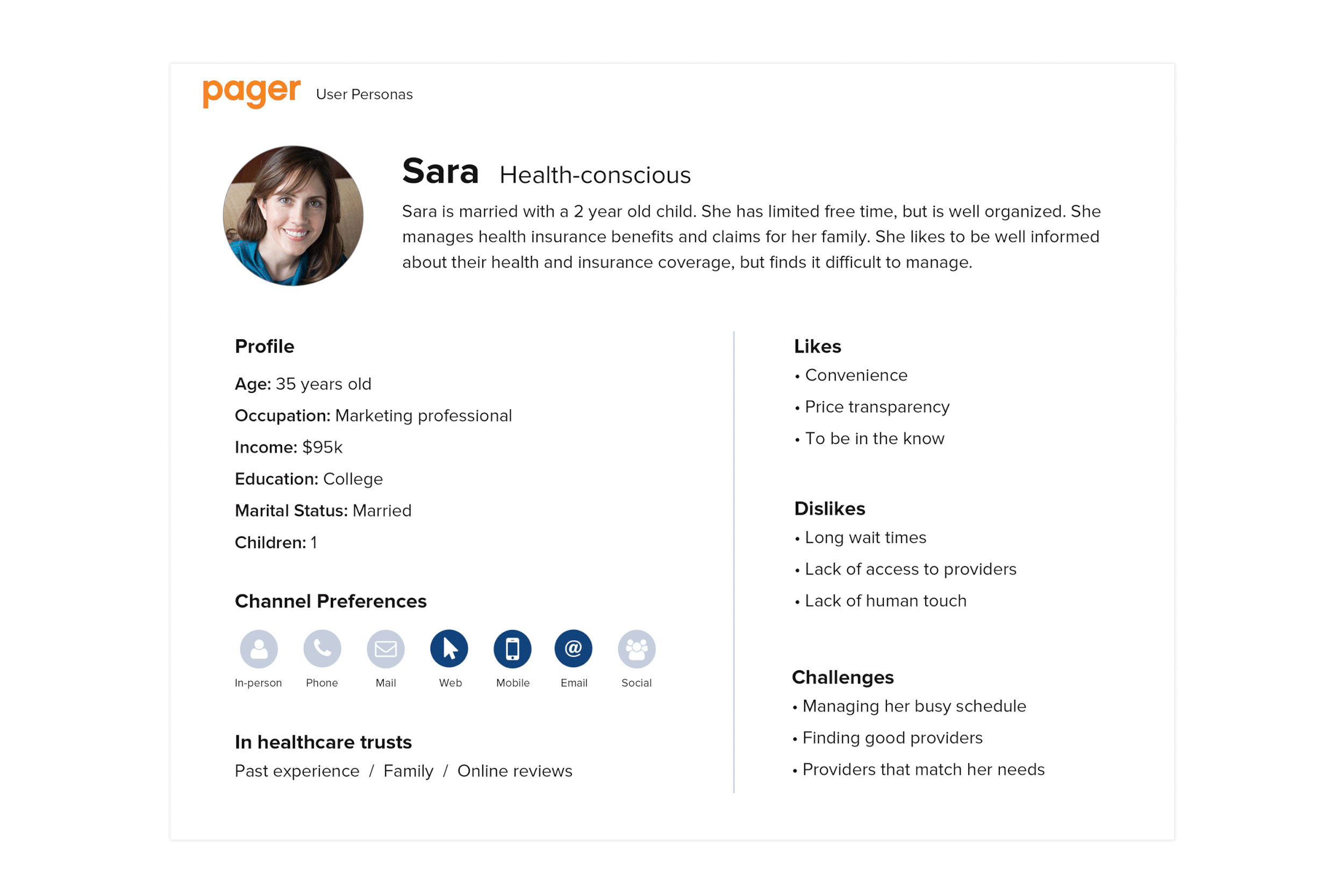
User Personas
Everyone has healthcare needs and the way people access and manage those needs varies. Using our most common scenarios, we defined our personas and focused our solutions.

User Journey
We developed a user journey that follows the patient through a familiar healthcare experience. Using our guiding principles and analyzing each stage of the journey, we identified opportunities within this familiar experience.
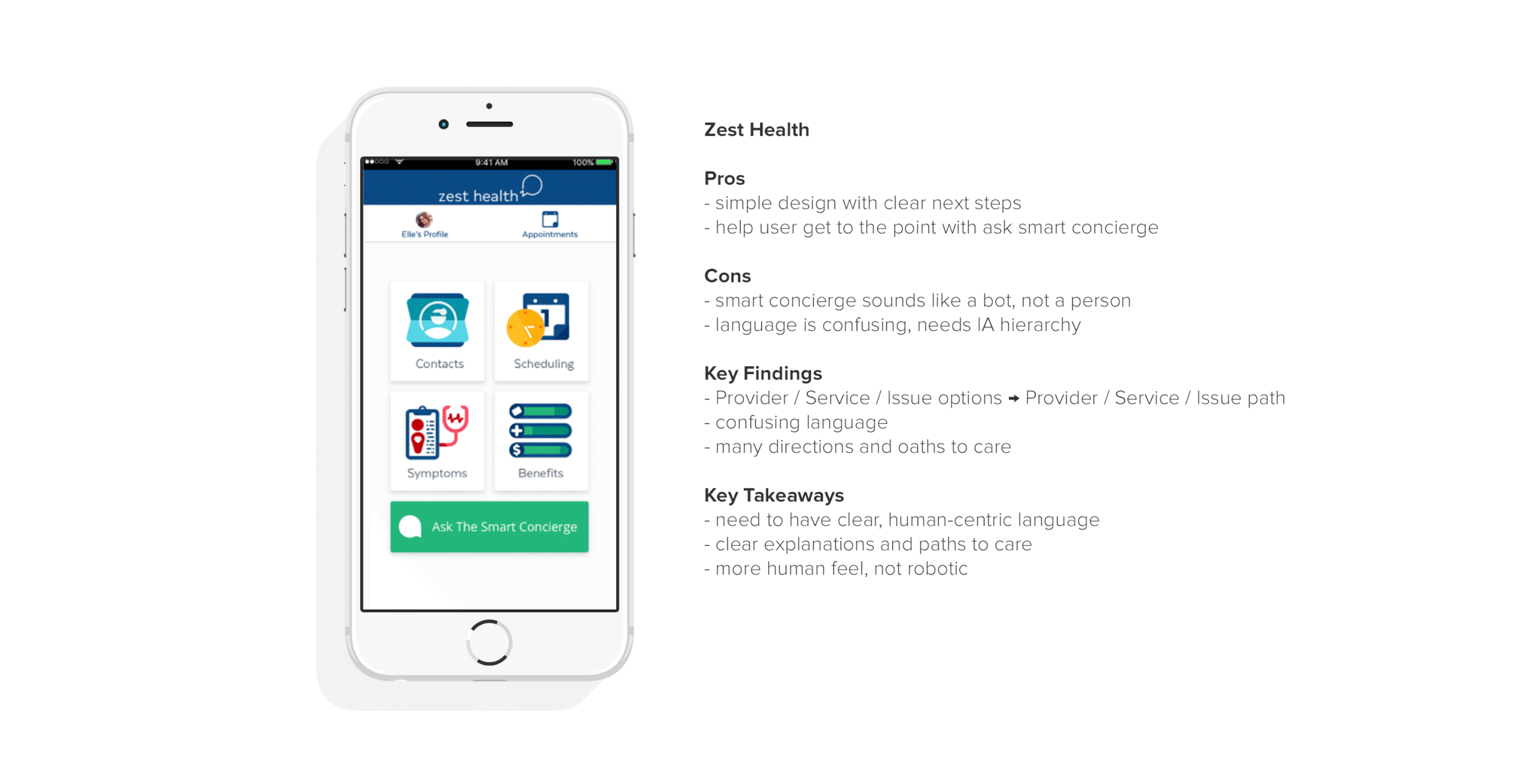
Competitive Analysis
We conducted a competitive analysis to determine the strengths and weaknesses of the current state of healthcare products and identified pain points and opportunities to see where we can improve on the experience.
What do these products all have in common?
Show information upfront
Clear navigation and care paths
3 out of 5 offer immediate option to chat
What did we want to implement?
Use human-centric, empathetic language that speaks to the user
Greet the user and make them feel welcome
Show information upfront and offer clear paths to care
Offer an option to quickly chat and connect with a human
Make sure IA hierarchy reflects care priorities
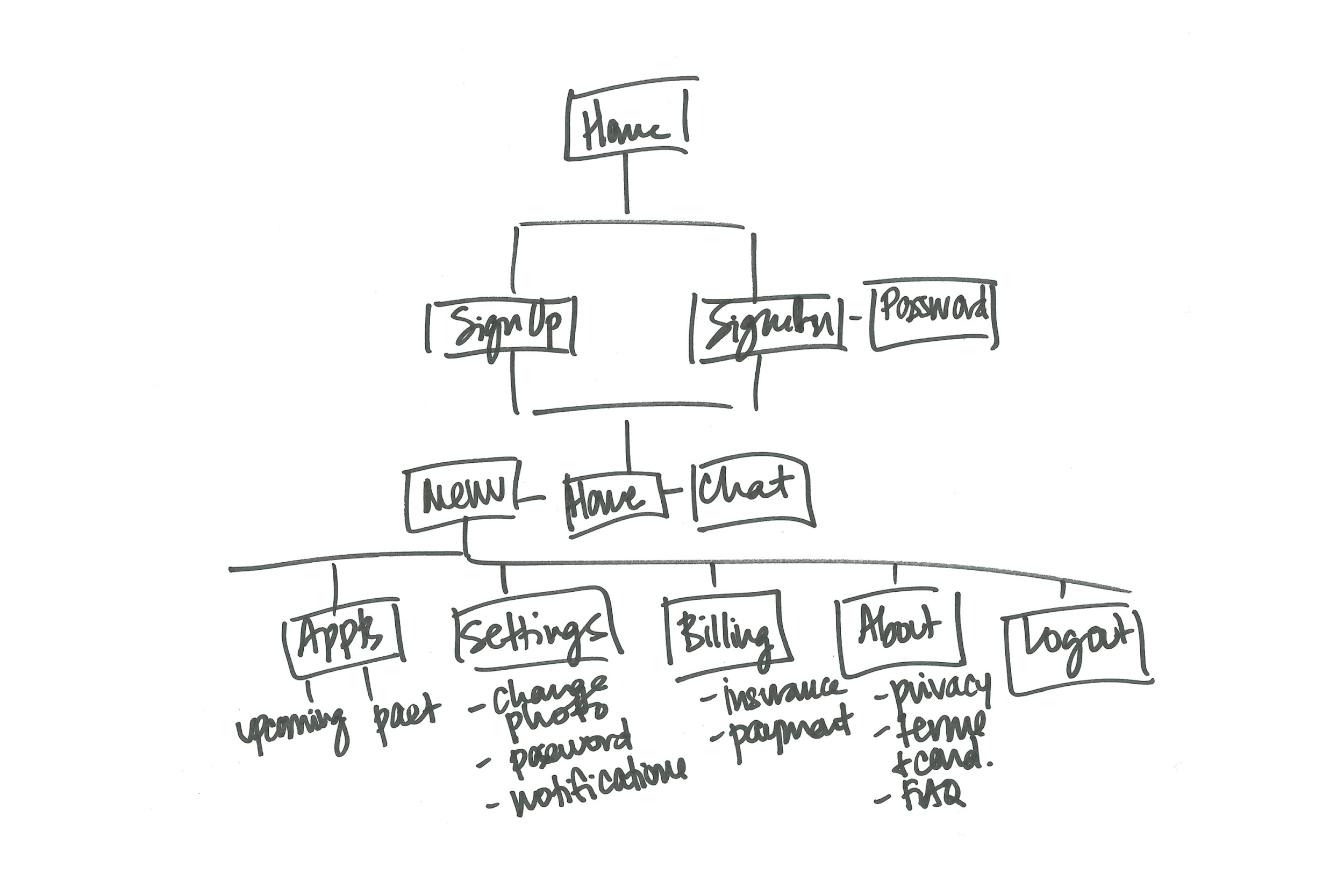
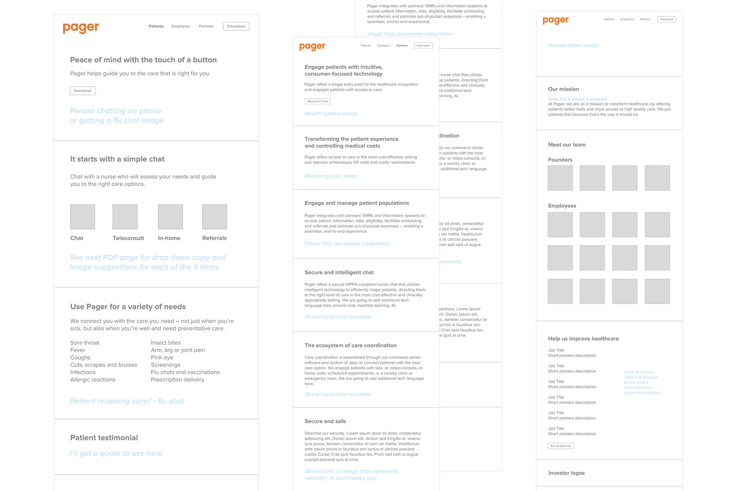
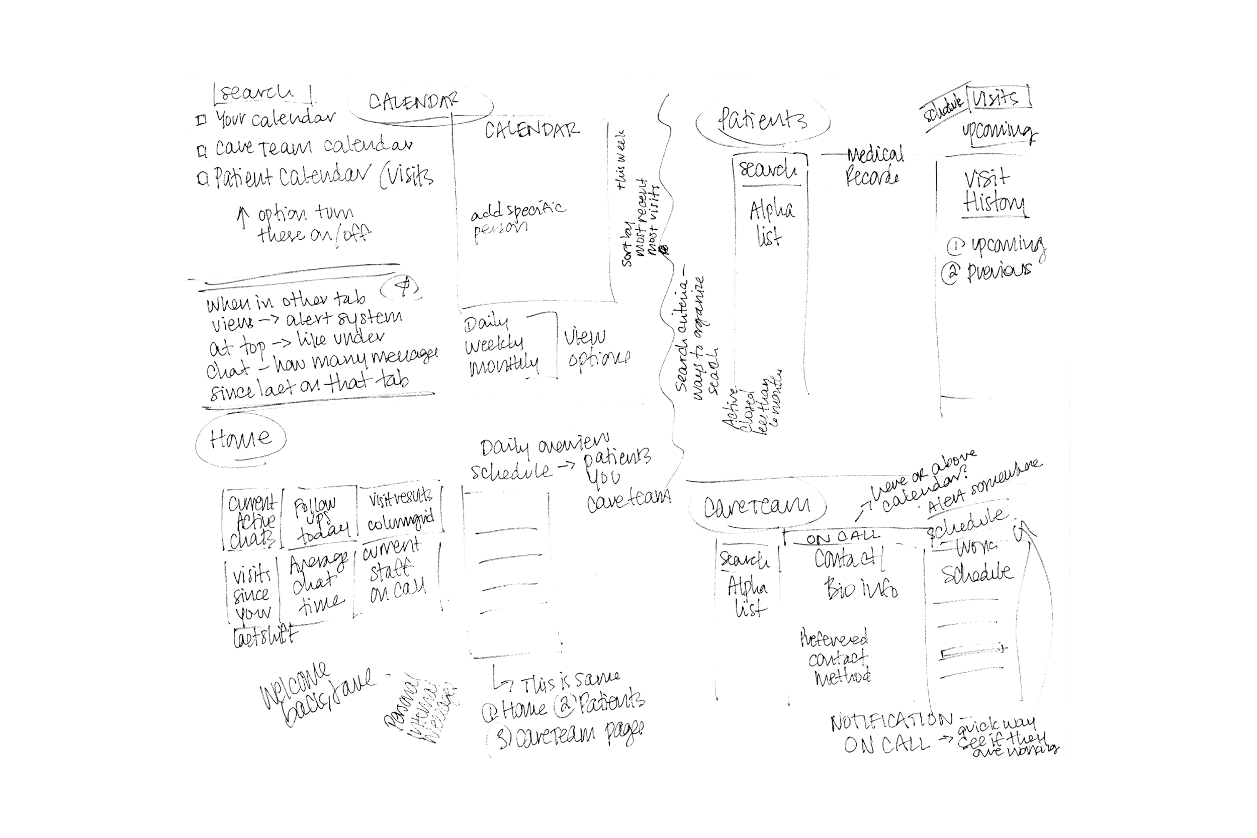
Wireframes
We wanted to create a clear and easy path to care for our users. Our wireframes helped us prioritize content, demonstrate functionalities and align stakeholders on requirements and execution.

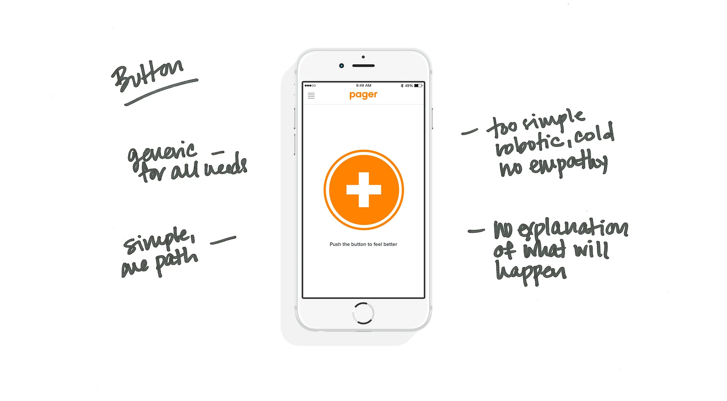
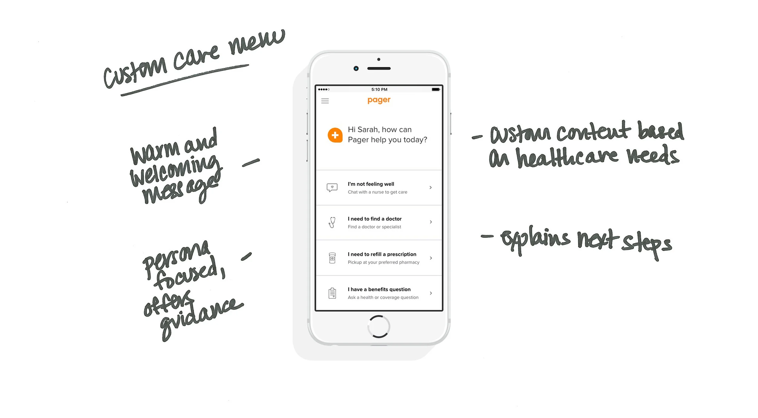
UX Solution
Previous designs neglected UX functionality. With the new design, we wanted to create a product that integrates research, user and business requirements and offers a flexible design to evolve with future product needs.

The Design Fixes Two Key Problems
When the patient enters chat, we have identified their intent and can offer an immediate response, reducing healthcare wait times.
The nurse is also managing multiple chats at once and now knows the patient intent upfront and can get to the point and immediately begin triage.
Key Takeaways
Utilize data and research to prioritize IA and content with an emphasis of putting the user first
Focus on UX to create an experience that makes sense for user needs
Use empathetic language that users can easily understand
Make it quick and easy for users to ask questions and access care
Create a design that is flexible and can adjust for future business needs
••••••••••
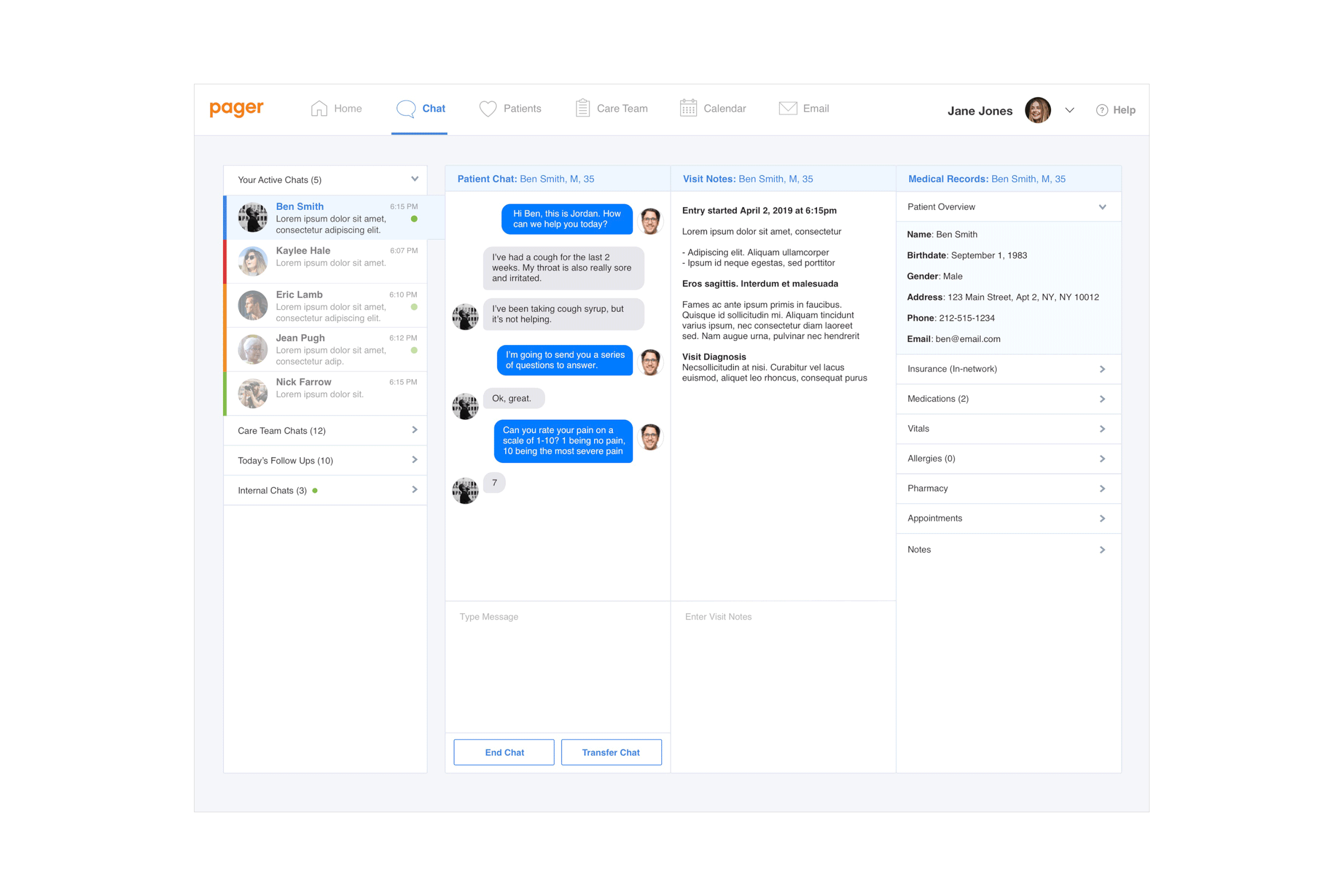
Pager Dashboard
Project: Pager Dashboard Design Role: UX/UI Design Lead
Managed research, UX/UI, and business requirements to create this medical dashboard concept.

The Challenge
Medical staff has to process and manage a lot of information in pressure-filled, fast-paced environments – all while providing quality care to patients. The Medical Dashboard should be an easy, useful tool to help staff quickly and efficiently do their job. The product also needs to integrate business requirements and the needs of the Care Team and Patients.

Project Requirements
Business Requirements
- Dashboard should be efficient (save time) and effective (correct diagnoses)
- Dashboard should allow for quick responses to reduce patient wait times
- Chat efficiencies and easy data recording saves time during and post chat
Care Team Requirements
- Dashboard should allow staff to easily find and scan information
- Care Team needs to easily manage multiple chats simultaneously
- Staff should be able to transfer and exchange information easily
- Care Team needs to easily record patient notes and avoid time-consuming paperwork
Patient Requirements
- “Healthcare is complicated, make it easy for me”
- Product should offer trusted, secure, and professional medical advice
- Needs to be a simple process with short wait times and quick responses
Research
At the time, remote healthcare was a new concept and technology; there was not a lot of publicly available competition. However, there were products available with similar functionalities that we referenced while creating this product to identify common practices and determine priorities. We also integrated Care Team and Patient needs based on common healthcare situations.
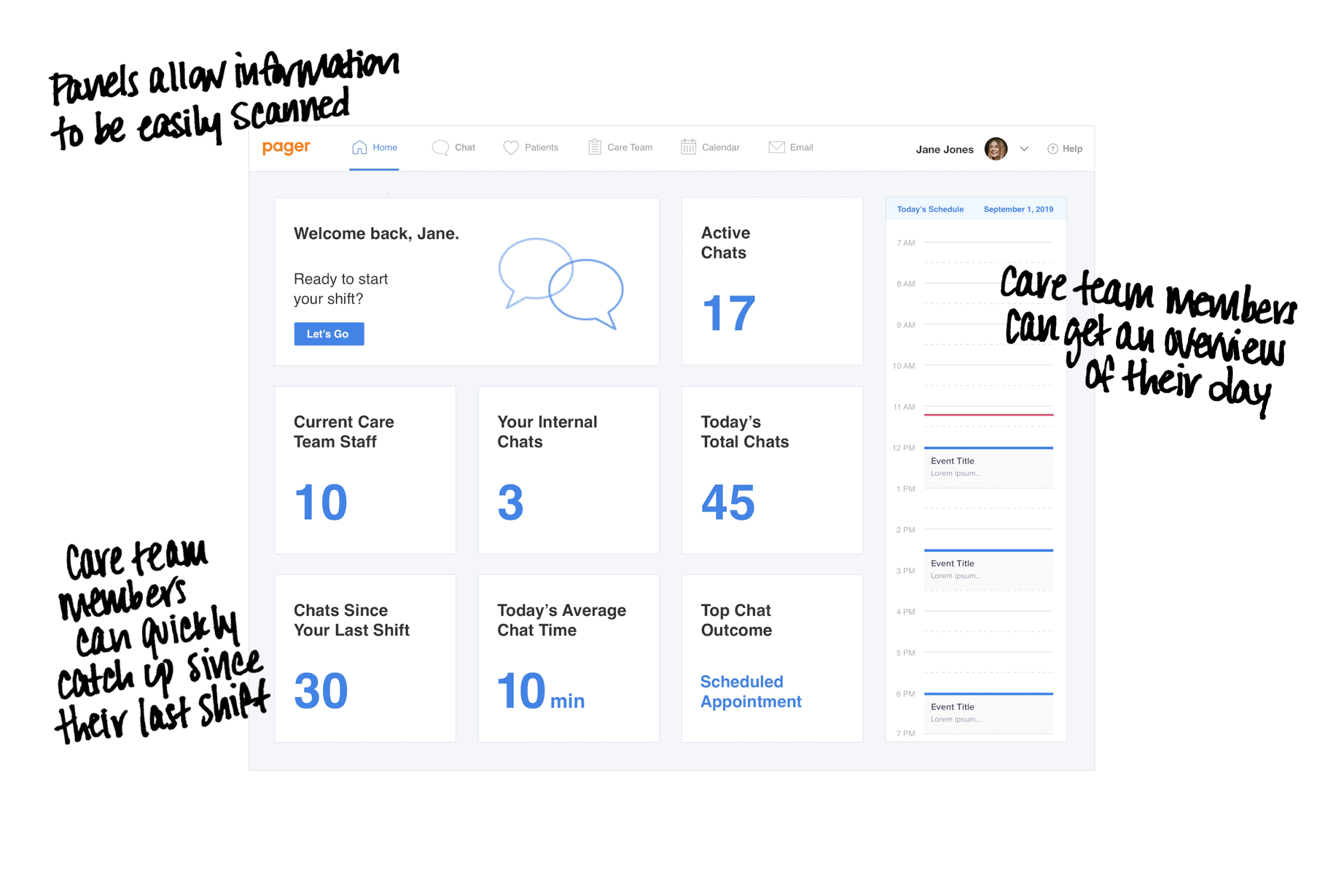
- Organize information in sections to be easily scanned and processed
- Use colors and text treatments to highlight urgent needs and priorities
- Easily navigate between tasks and pertinent information
- Clean and clear design that shows information upfront and offers clear steps
Research Learnings and Implementation
We sketched and refined wireframe concepts to integrate all requirements and functionalities. This helped prioritize the complicated content needs.
Wireframes
The design concept integrated business requirements, functionalities, and research learnings. The clean design helps the Care Team easily consume a lot of information and do their jobs to the best of their abilities. The design was now ready for build, testing and iterations.
Design Solution
- Importance of referencing designs across all industries that are relevant to the product needs
- Continue iterating, integrating, and updating based on team and consumer feedback
- Look for more ways to improve the communication process


Key Takeaways
- Importance of referencing designs across all industries that are relevant to the product needs
- Continue iterating, integrating, and updating based on team and consumer feedback
- Look for more ways to improve the communication process