Pager | Creative Operations, Product Strategy & Design Leadership
Creative Operations • Brand & Product Strategy • Integrated Campaigns • UX Leadership • Systems Thinking
Role: Creative Operations & Product Strategy Lead
At Pager, a high-growth digital health startup, I led the unification of brand voice and product experience across a fragmented ecosystem. By bridging the gap between Product, Engineering, and Marketing, I shifted the organization from reactive execution to a systems-led model, driving trust and engagement in the complex healthcare space.
The Strategy: Creating Connective Tissue
High-growth environments often suffer from silos. I joined Pager to serve as a strategic partner, focusing on how work moved through the organization to support scale, clarity, and trust.
Challenges Addressed:
Operational Friction: Teams lacked consistent workflows and shared decision frameworks.
Brand Fragmentation: Inconsistent visuals across digital and physical touchpoints.
Strategic Drift: Product efforts were often reactive rather than aligned with business goals.
Key Initiatives & Impact
Creative Operations & Workflow Optimization
I mapped end-to-end workflows to identify bottlenecks and reduce decision fatigue.
Implemented: Intake, prioritization, and governance frameworks.
Outcome: Faster execution cycles, reduced rework, and a shared language between cross-functional teams.
Product & UX Modernization
I led the "zero-to-one" phases for Pager’s core interfaces, focusing on user engagement and trust.
User Journeys: Developed comprehensive maps following patients through familiar healthcare scenarios.
Consistency: Created a scalable brand kit and shared UX patterns across mobile and web platforms.
Result: Shipped foundational interfaces that supported market entry and increased engagement with high-value features.
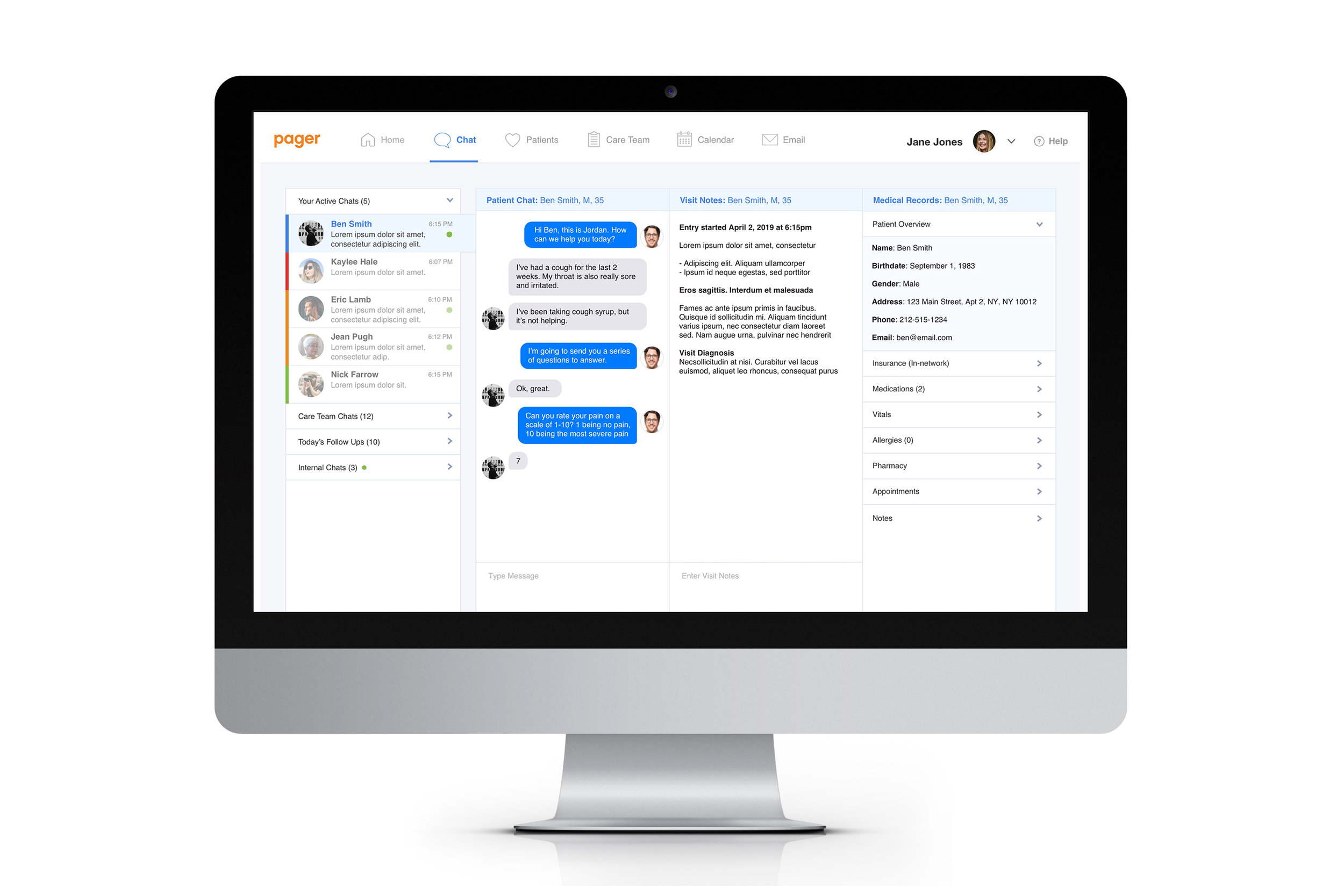
The Medical Dashboard
Managed research and UX for an internal tool designed for medical staff in high-pressure environments.
The Problem: Staff needed to manage multiple chats while providing quality care.
The Solution: A clean, scannable interface that highlights urgent needs and allows for quick data recording.
Impact: Reduced patient wait times and decreased post-chat paperwork for the care team.
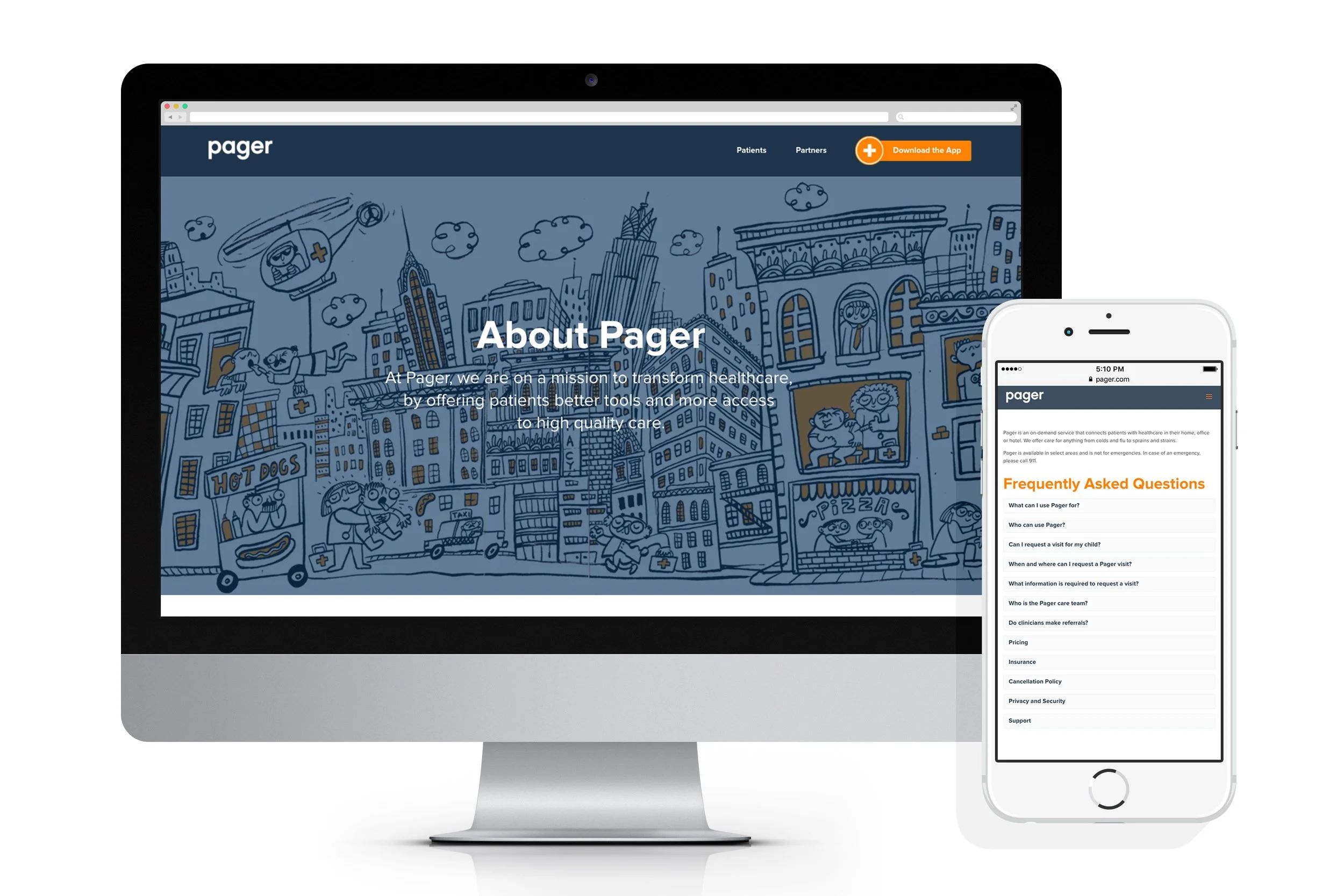

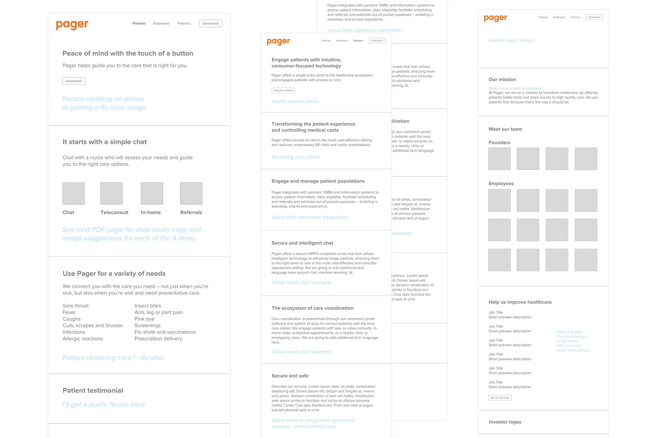
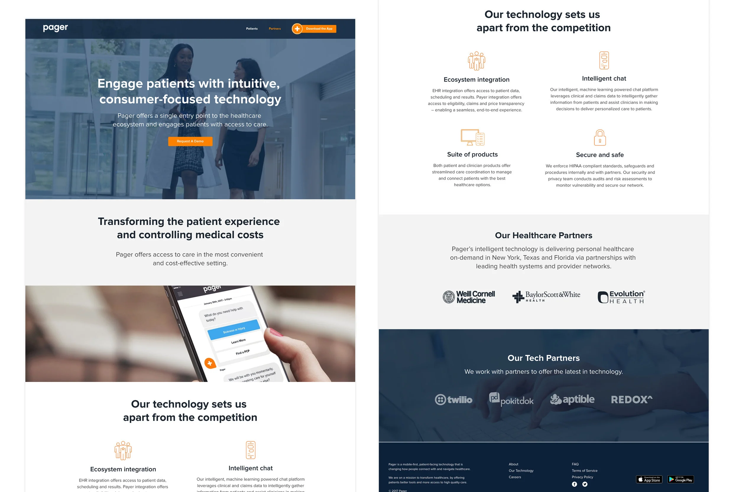
Pager Website
To address growing complexity, I mapped end-to-end workflows across teams to identify bottlenecks and decision fatigue. My focus was on building clarity, reducing friction, and creating repeatable systems that could scale across products. I worked at the intersection of design, strategy, and operations to develop a cohesive and scalable framework across a multi-product initiatives to establish brand consistency and efficiency.
What I Led
- Defined intake, prioritization, and delivery workflows / Workflow mapping and friction analysis
- Improved handoff and delivery processes
- Clear ownership and prioritization models across teams / Enabled teams to focus on high-impact work
Impact
- Faster execution across initiatives
- Reduced rework and ambiguity and gained shared language
- Stronger cross-functional collaboration / Product decisions became more consistent and measurable
The work emphasized operational clarity, scalable processes, and experience consistency — creating the conditions for stronger engagement and more efficient delivery.
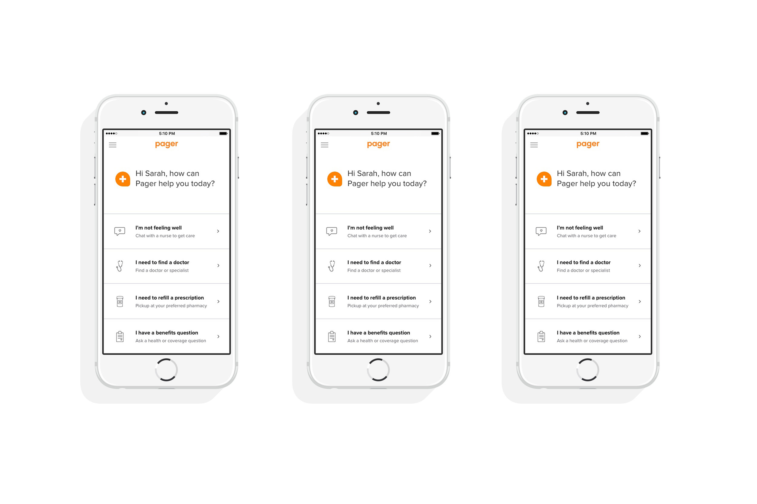
Pager App
Goal: User Engagement & Trust
Focus: User engagement and usability
Managed UX/UI, content, and production for the Pager app home screen redesign.
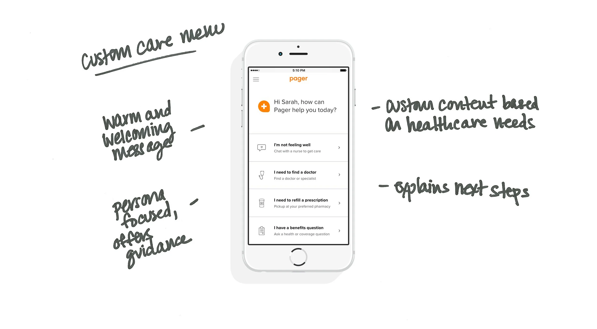
Healthcare is complex; patients are often overwhelmed. I led the "zero-to-one" product design phases, translating complex journey mapping into an intuitive mobile and web experience.
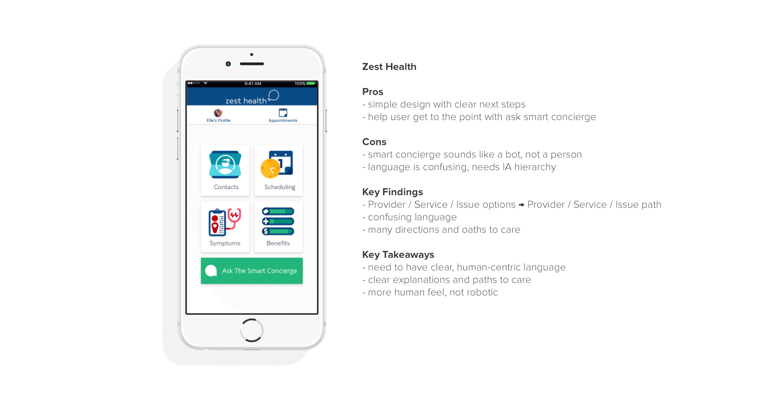
Competitive Analysis
We conducted a competitive analysis to determine the strengths and weaknesses of the current state of healthcare products and identified pain points and opportunities to see where we can improve on the experience.
What do these products all have in common?
- Show information upfront
- Clear navigation and care paths
- 3 out of 5 offer immediate option to chat
What did we want to implement?
- Use human-centric, empathetic language that speaks to the user
- Greet the user and make them feel welcome
- Show information upfront and offer clear paths to care
- Offer an option to quickly chat and connect with a human
- Make sure IA hierarchy reflects care priorities
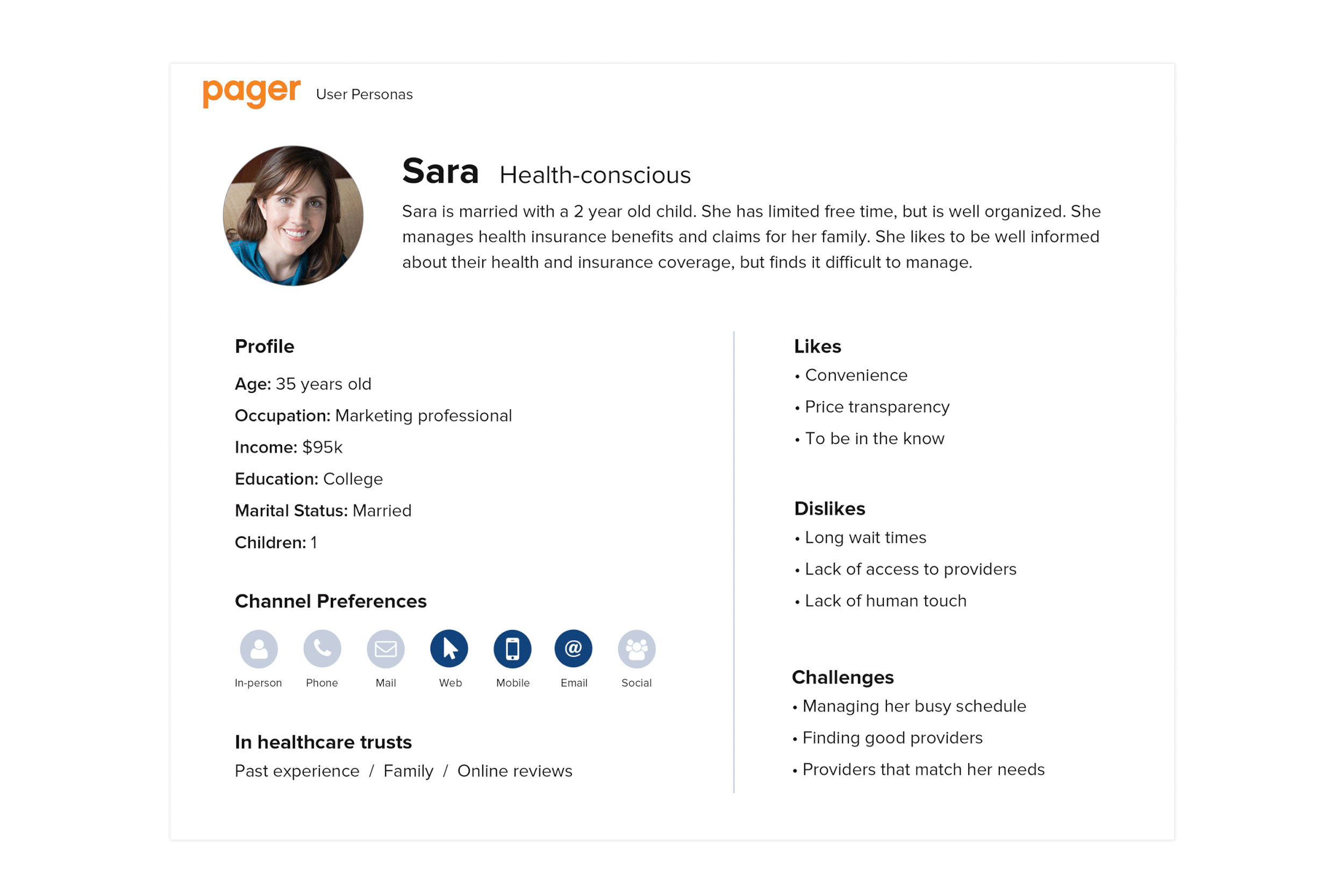
User Personas
Everyone has healthcare needs and the way people access and manage those needs varies. Using our most common scenarios, we defined our personas and focused our solutions.
User Journey
We developed a user journey that follows the patient through a familiar healthcare experience. Using our guiding principles and analyzing each stage of the journey, we identified opportunities within this familiar experience.

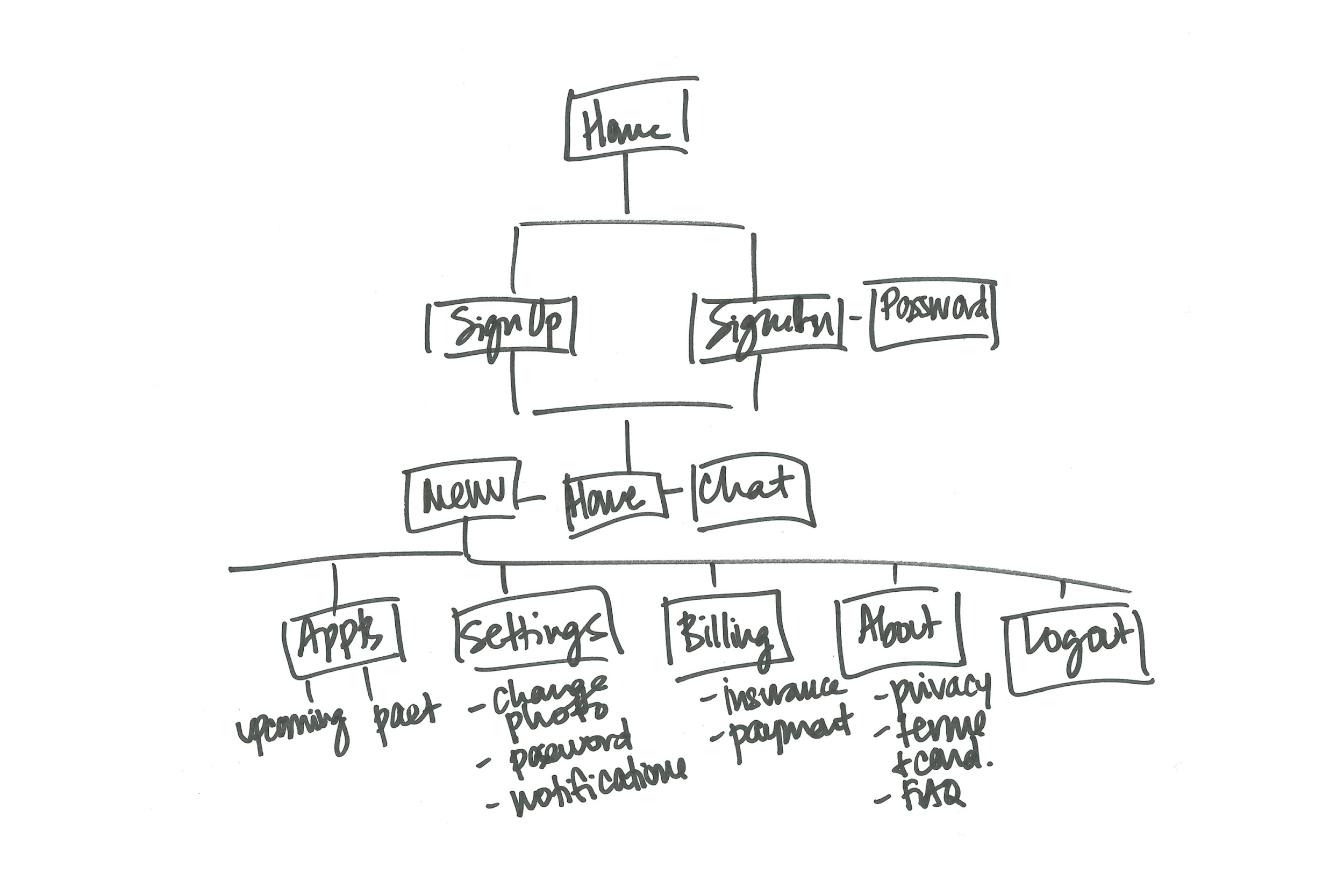
Wireframes
We wanted to create a clear and easy path to care for our users. Our wireframes helped us prioritize content, demonstrate functionalities and align stakeholders on requirements and execution.

UX Solution
Previous designs neglected UX functionality. With the new design, we wanted to create a product that integrates research, user and business requirements and offers a flexible design to evolve with future product needs.
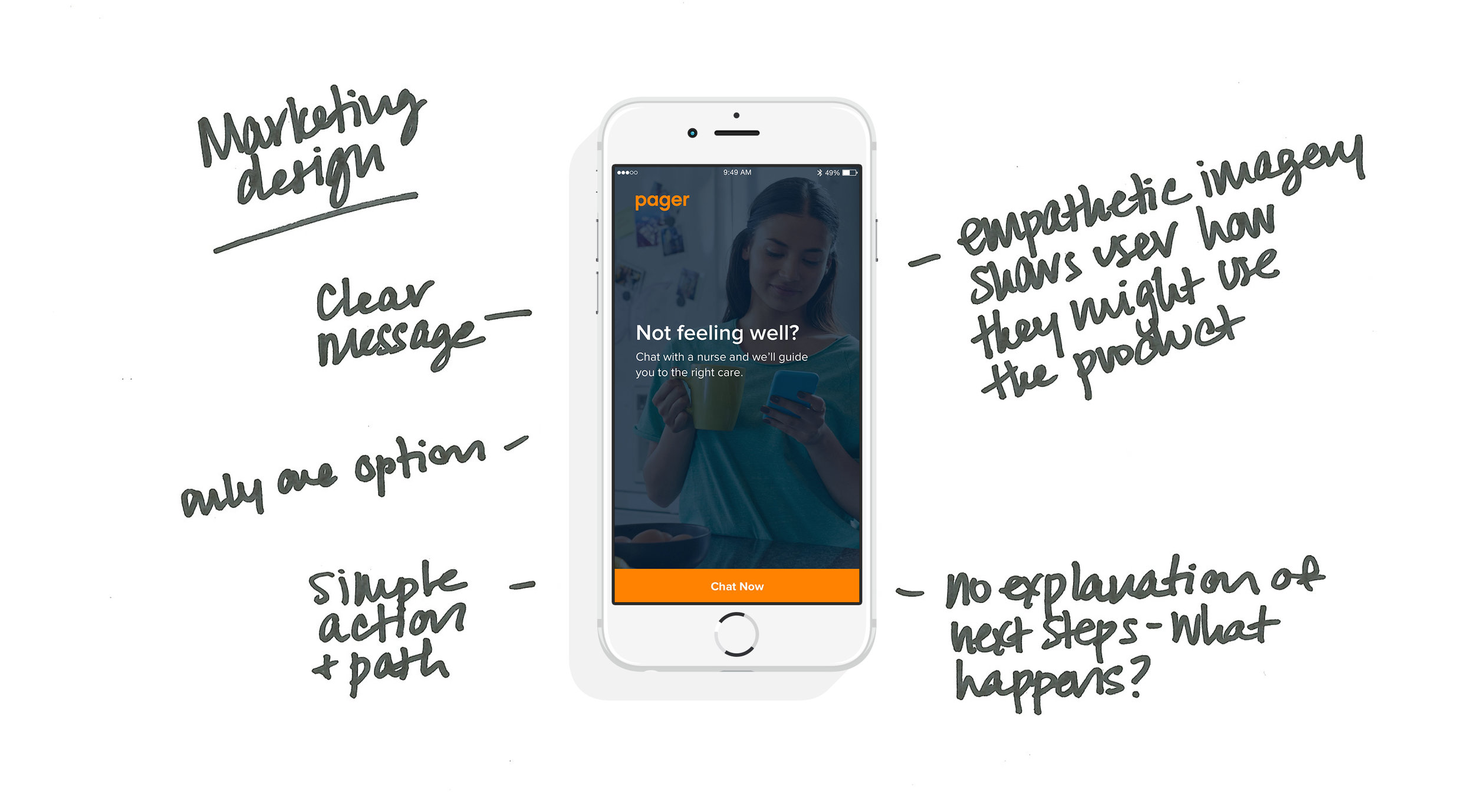
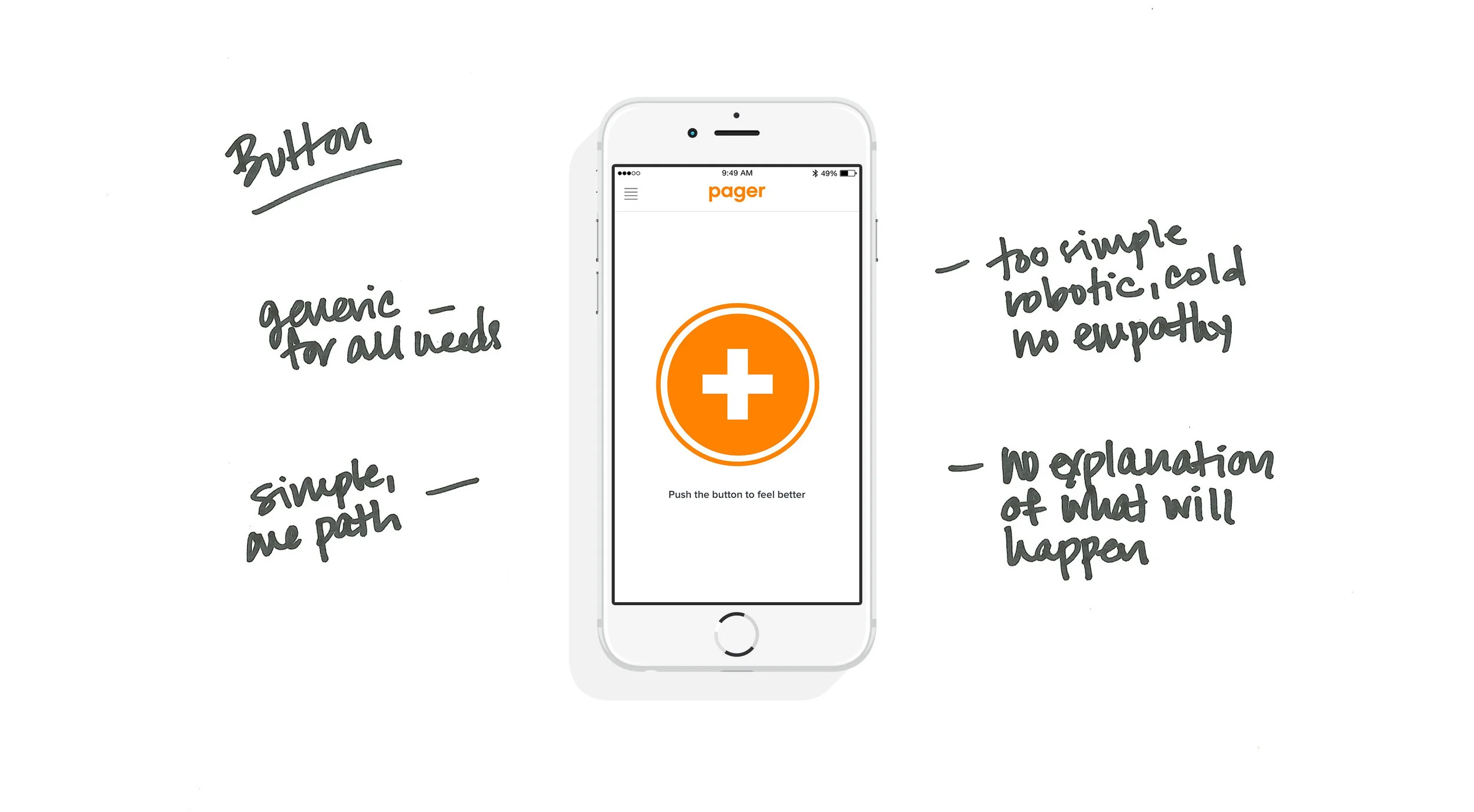
The New Design Fixes Two Key Problems
- When the patient enters chat, we have identified their intent and can offer an immediate response, reducing healthcare wait times.
- The nurse is also managing multiple chats at once and now knows the patient intent upfront and can get to the point and immediately begin triage.
Key Takeaways
- Utilize data and research to prioritize IA and content with an emphasis of putting the user first
- Focus on UX to create an experience that makes sense for user needs
- Use empathetic language that users can easily understand
- Make it quick and easy for users to ask questions and access care
- Create a design that is flexible and can adjust for future business needs
The Result: Shipped the foundational interfaces that supported Pager’s initial market entry and built the trust necessary for a modern digital health leader.
What I Led
- Defined key user journeys and success criteria
- Partnered with Product and Engineering on prioritization
- Guided UX strategy and experience direction
Outcome
- Clearer, more intuitive user flows
- Increased engagement with high-value features
- Stronger alignment between product decisions and user needs
Pager Dashboard
Managed research, UX/UI, and business requirements to create this medical dashboard concept.
The Challenge
Medical staff has to process and manage a lot of information in pressure-filled, fast-paced environments – all while providing quality care to patients. The Medical Dashboard should be an easy, useful tool to help staff quickly and efficiently do their job. The product also needs to integrate business requirements and the needs of the Care Team and Patients.
Project Requirements
Business Requirements
- Dashboard should be efficient (save time) and effective (correct diagnoses)
- Dashboard should allow for quick responses to reduce patient wait times
- Chat efficiencies and easy data recording saves time during and post chat
Care Team Requirements
- Dashboard should allow staff to easily find and scan information
- Care Team needs to easily manage multiple chats simultaneously
- Staff should be able to transfer and exchange information easily
- Care Team needs to easily record patient notes and avoid time-consuming paperwork
Patient Requirements
- “Healthcare is complicated, make it easy for me”
- Product should offer trusted, secure, and professional medical advice
- Needs to be a simple process with short wait times and quick responses
Research
At the time, remote healthcare was a new concept and technology; there was not a lot of publicly available competition. However, there were products available with similar functionalities that we referenced while creating this product to identify common practices and determine priorities. We also integrated Care Team and Patient needs based on common healthcare situations.
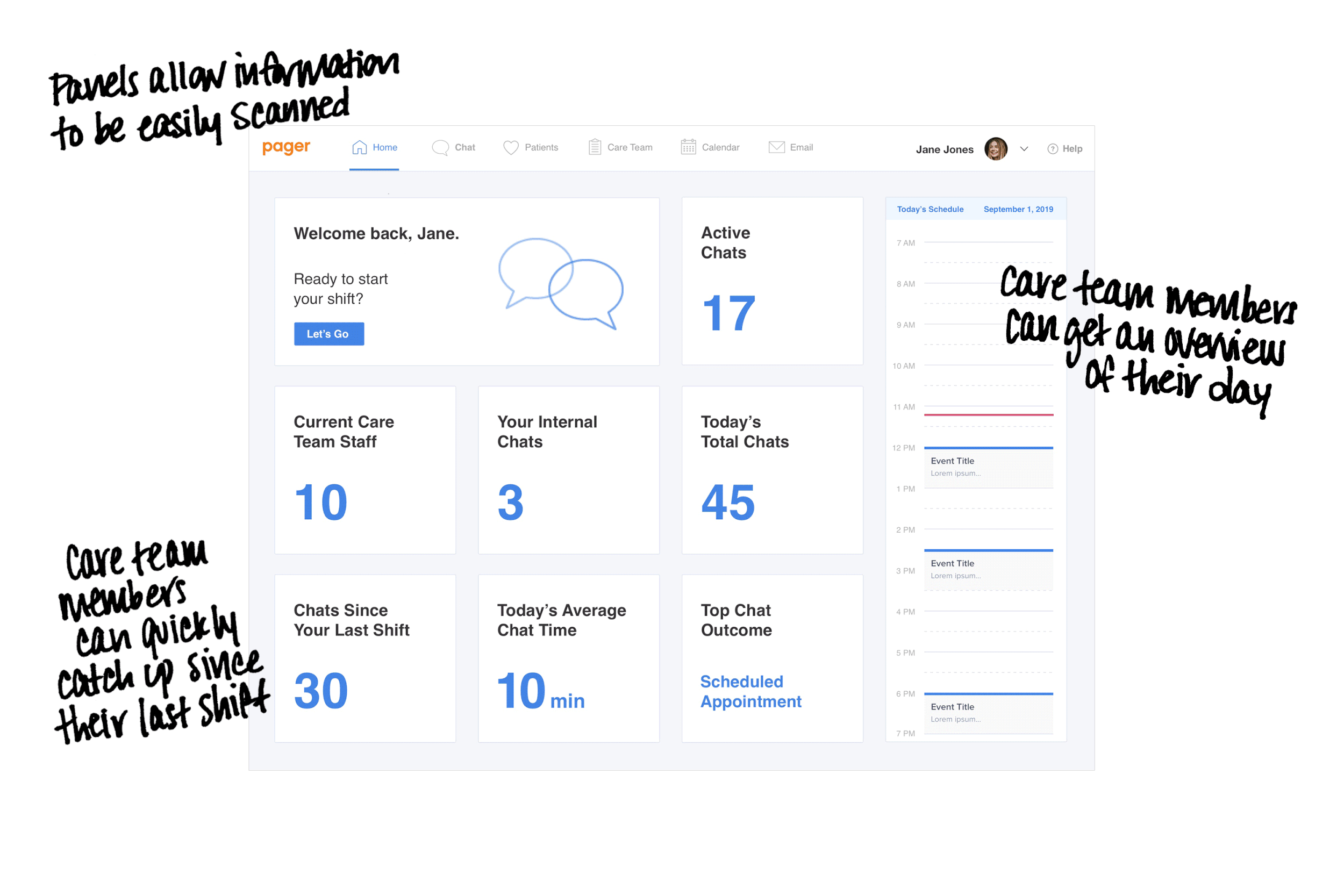
- Organize information in sections to be easily scanned and processed
- Use colors and text treatments to highlight urgent needs and priorities
- Easily navigate between tasks and pertinent information
- Clean and clear design that shows information upfront and offers clear steps
Research Learnings and Implementation
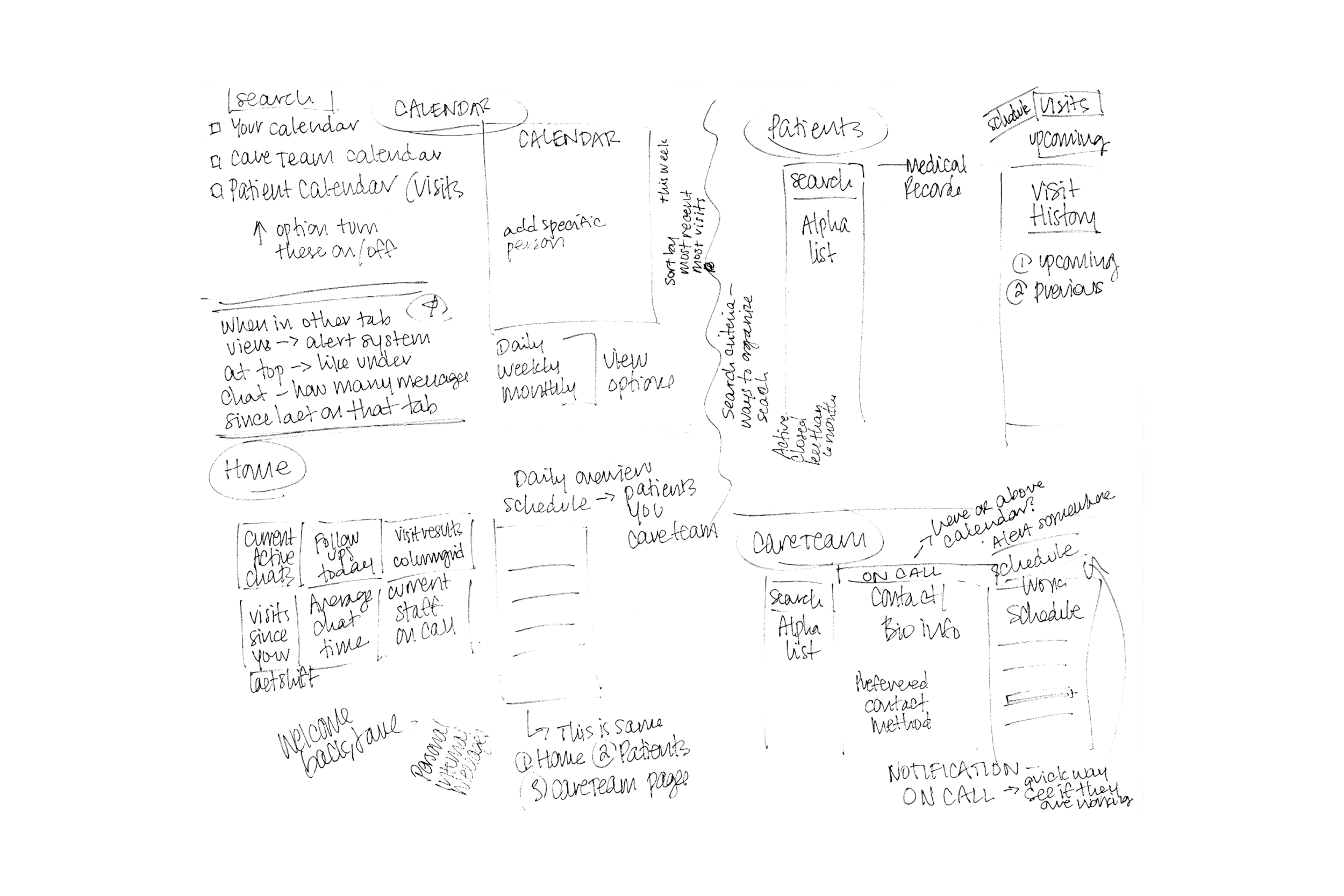
We sketched and refined wireframe concepts to integrate all requirements and functionalities. This helped prioritize the complicated content needs.
Wireframes
The design concept integrated business requirements, functionalities, and research learnings. The clean design helps the Care Team easily consume a lot of information and do their jobs to the best of their abilities. The design was now ready for build, testing and iterations.
Design Solution
- Importance of referencing designs across all industries that are relevant to the product needs
- Continue iterating, integrating, and updating based on team and consumer feedback
- Look for more ways to improve the communication process
Key Takeaways
- Importance of referencing designs across all industries that are relevant to the product needs
- Continue iterating, integrating, and updating based on team and consumer feedback
- Look for more ways to improve the communication process
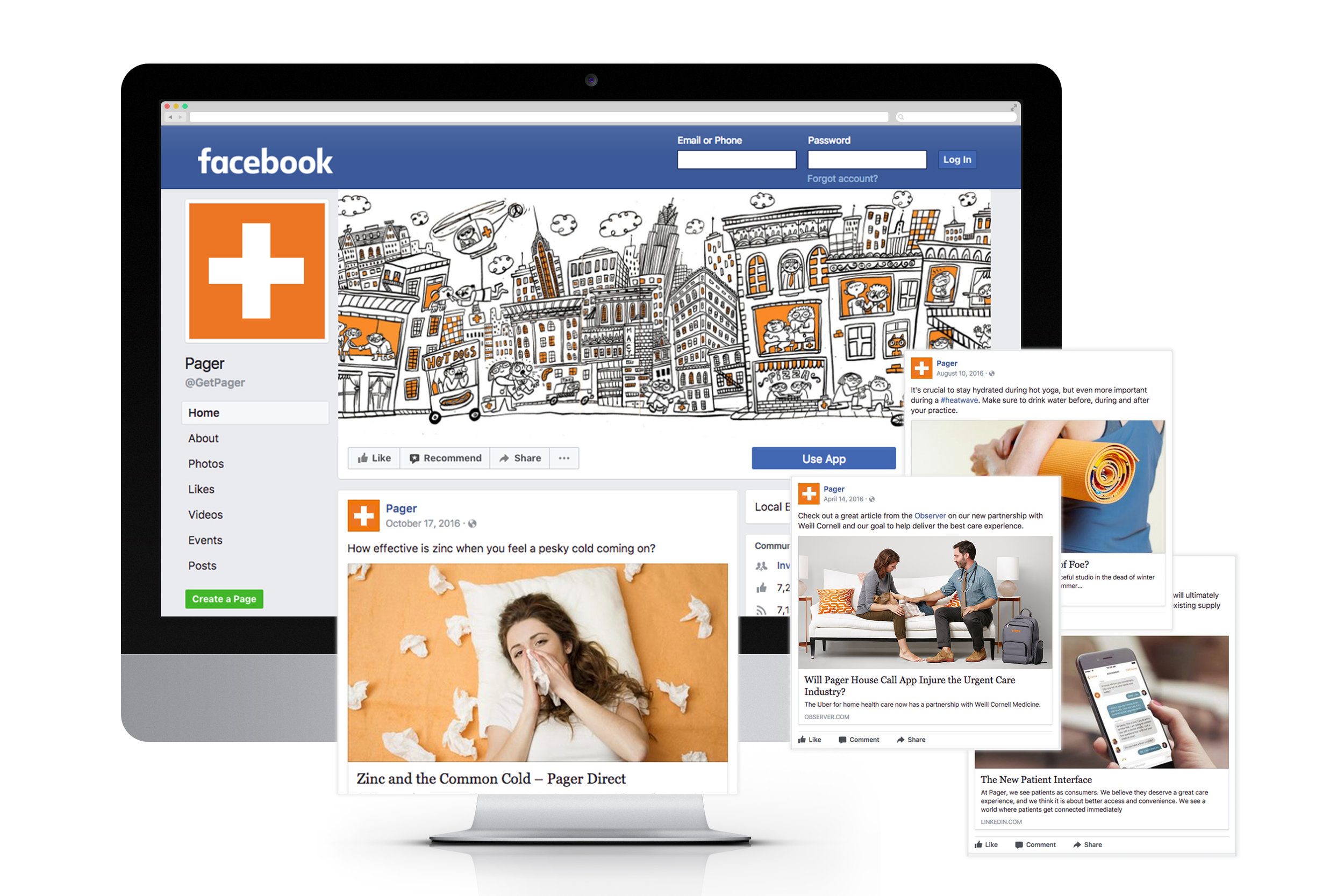
Brand Identity & Integrated Marketing
I defined Pager’s visual identity from the ground up, ensuring the brand felt human-centered despite its technical nature.
Pager Brand Identity: Developed the first company-wide brand guidelines.
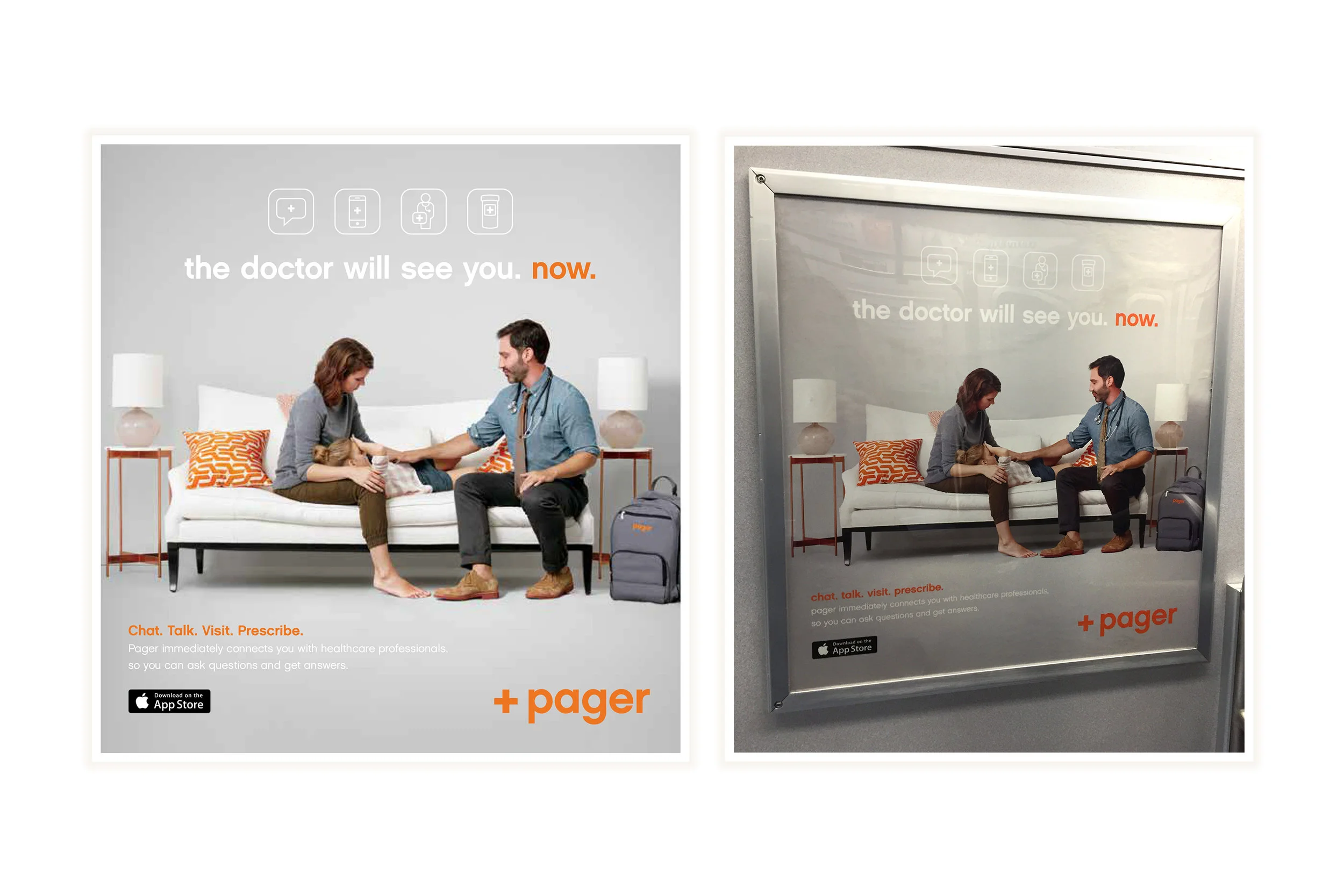
Integrated Campaigns: Led "Pager OOO" and OOH (Out-of-Home) campaigns, including subway and billboard ads to drive consumer awareness.
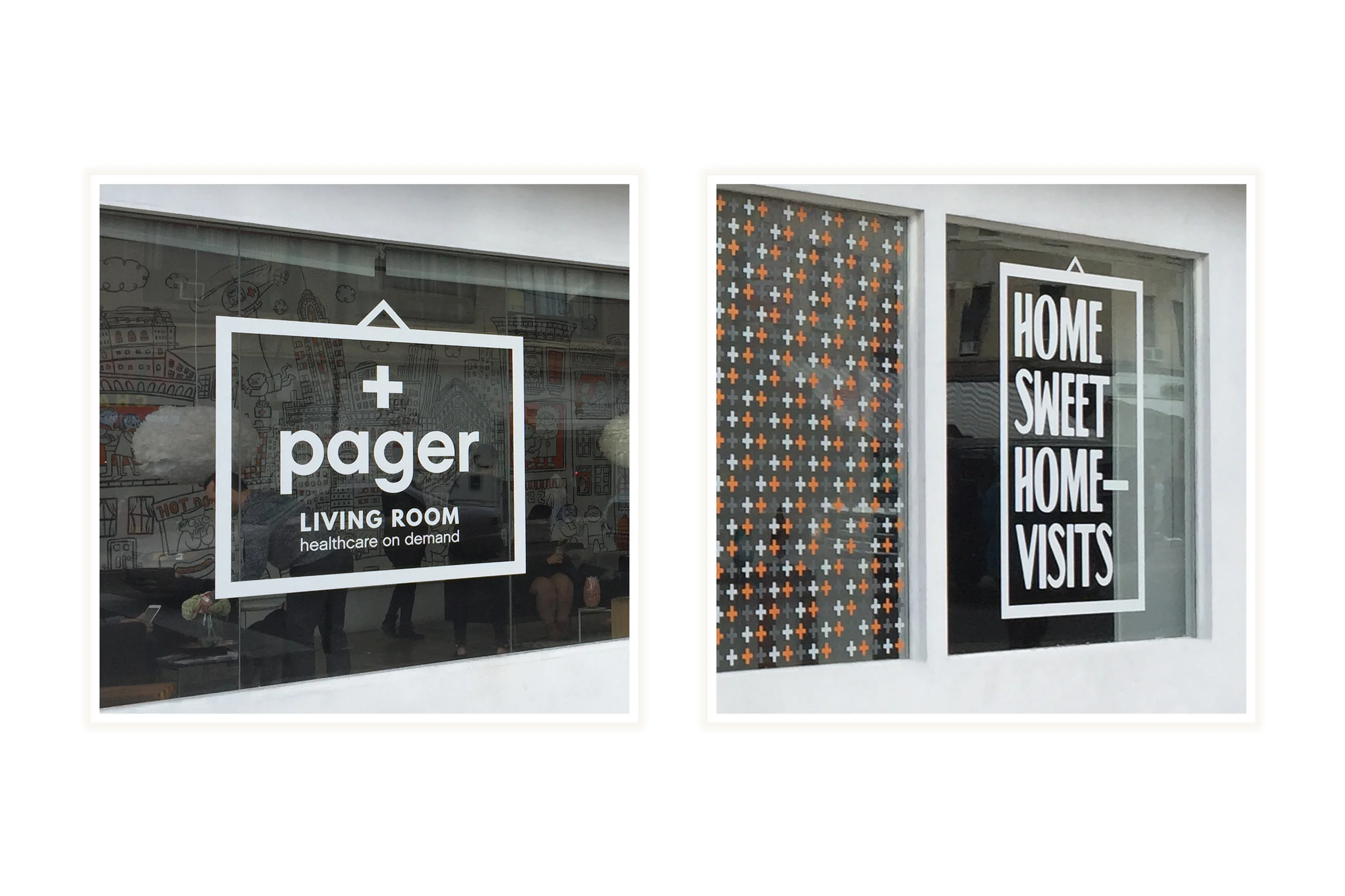
Immersive Experiences: Directed the "Pager Living Room" physical pop-up to humanize the virtual care experience.
Brand, Marketing & Events
As part of the Pager team, I helped shape the brand by defining its visual identity, launching integrated marketing campaigns, and designing immersive experiences like Pager Living Room that brought our mission to life in meaningful ways.


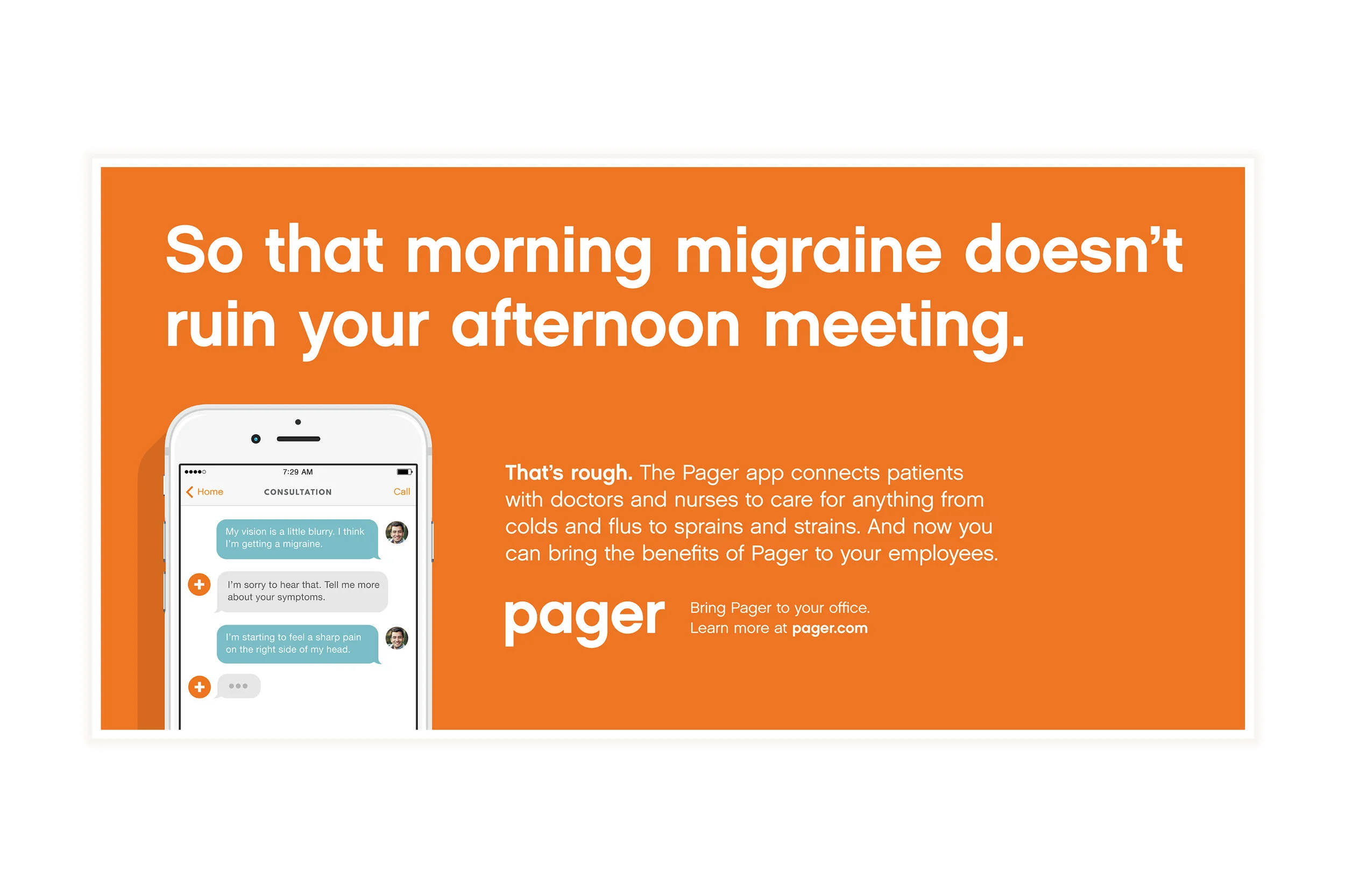
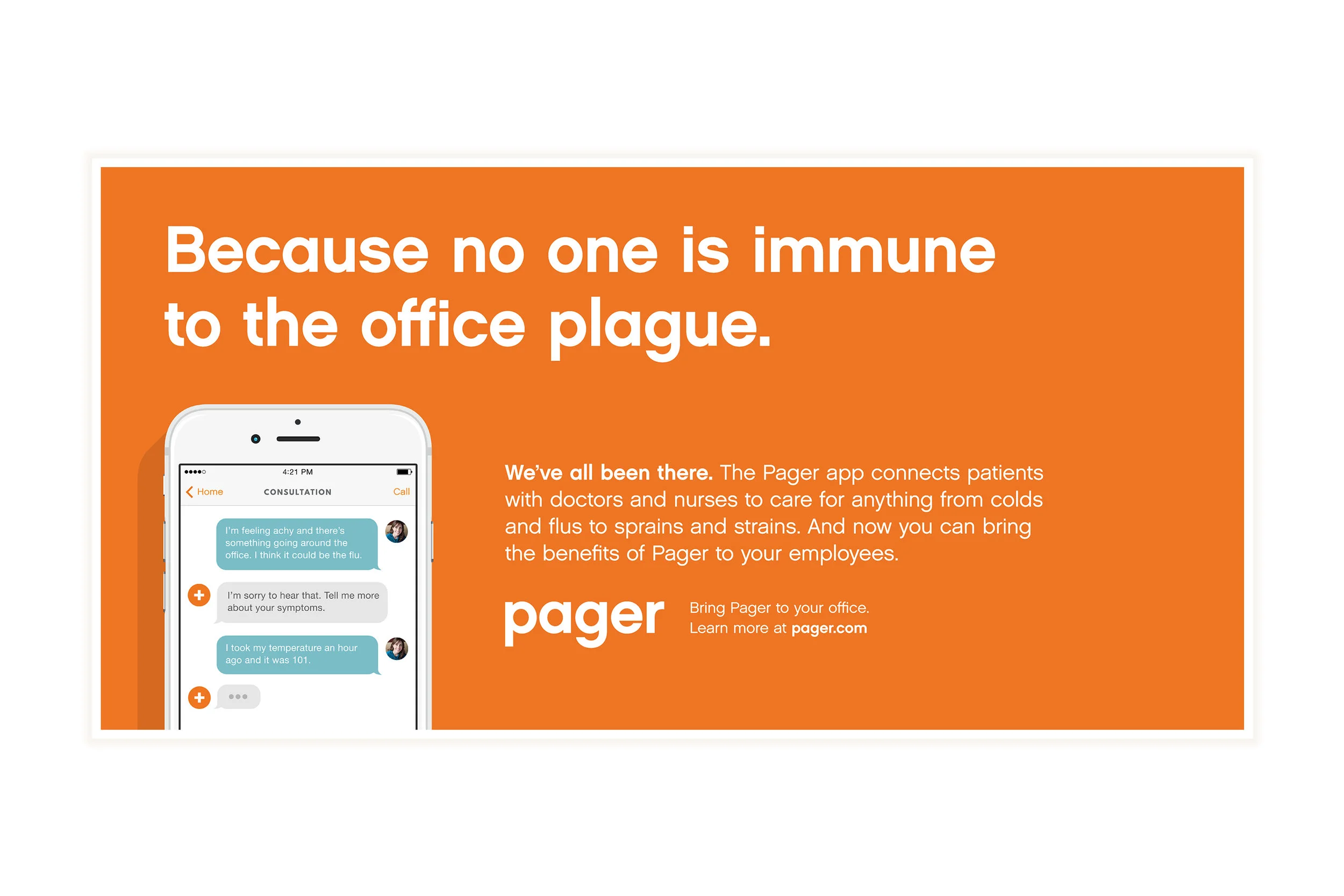
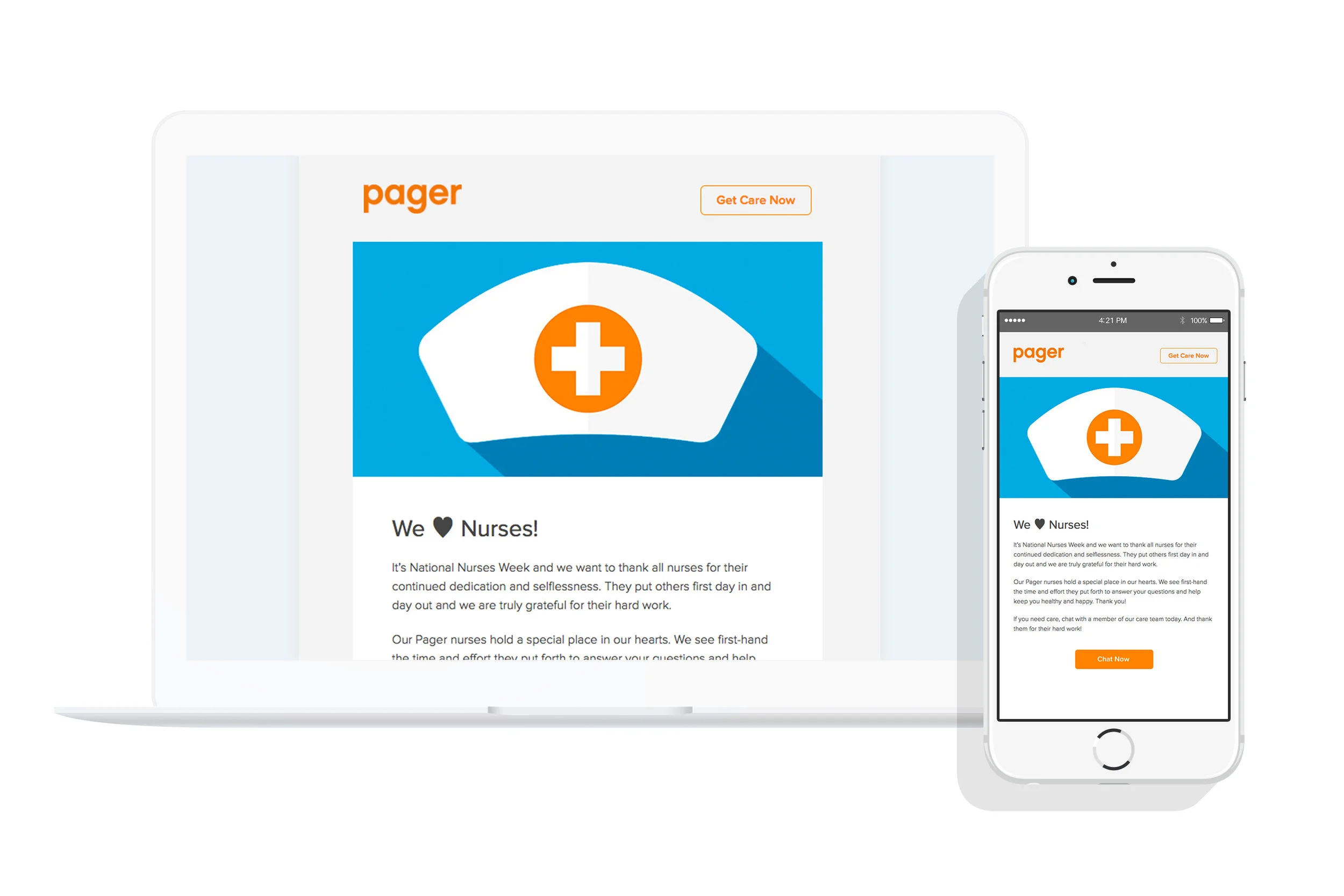
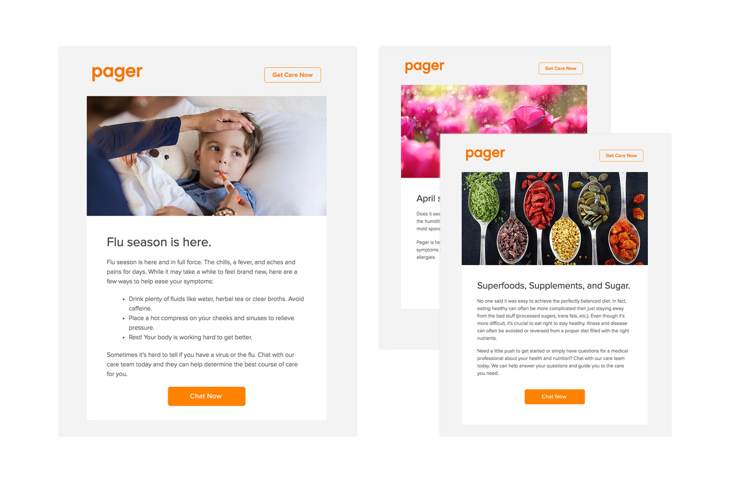
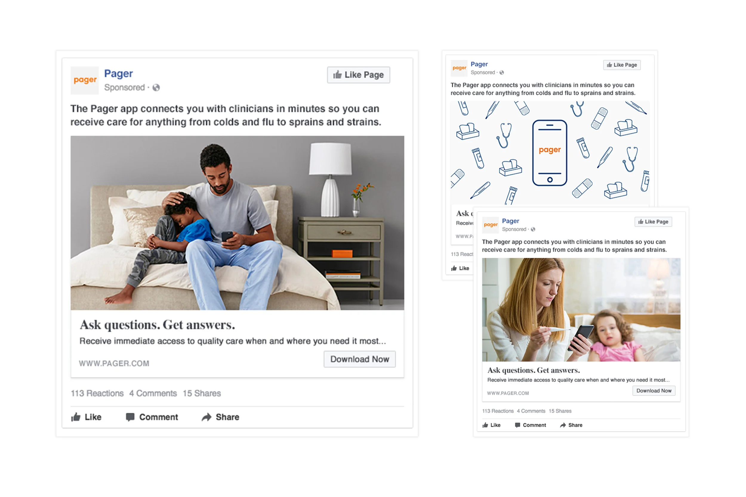
Integrated Marketing Campaign
I led creative for launch and awareness campaigns that introduced Pager’s value to new audiences and built trust with existing ones. From digital ads to print collateral, my work connected product messaging with real-world relevance, driving engagement and growing brand awareness across channels.


Pager Living Room
Project: Pager Living Room
Role: Creative Director
I led creative direction for Pager Living Room, an immersive brand activation that brought our mission to life in a physical space. From concept to execution, I helped shape the experience, visual design, and storytelling moments that introduced attendees to a more human-centered future of healthcare.