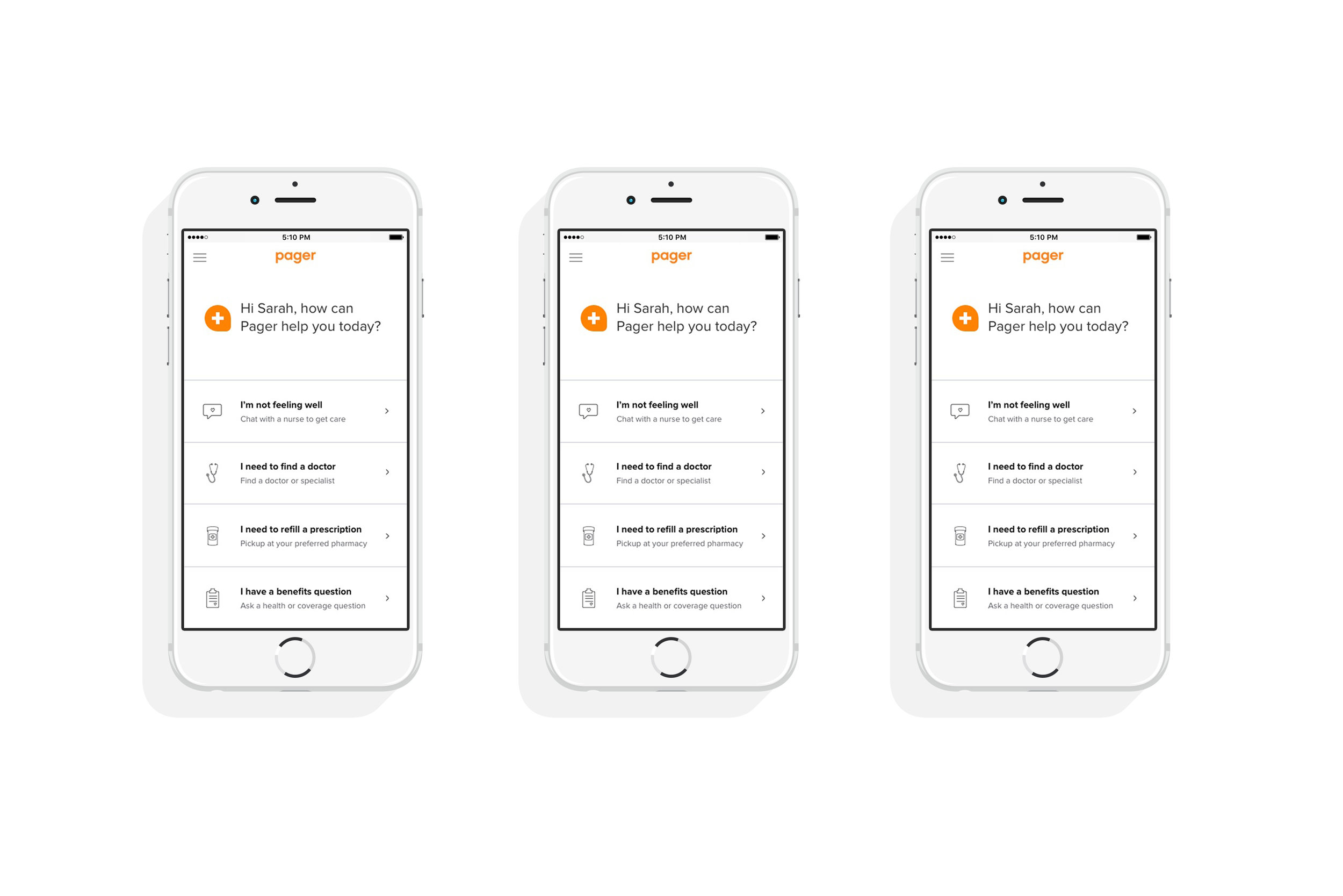
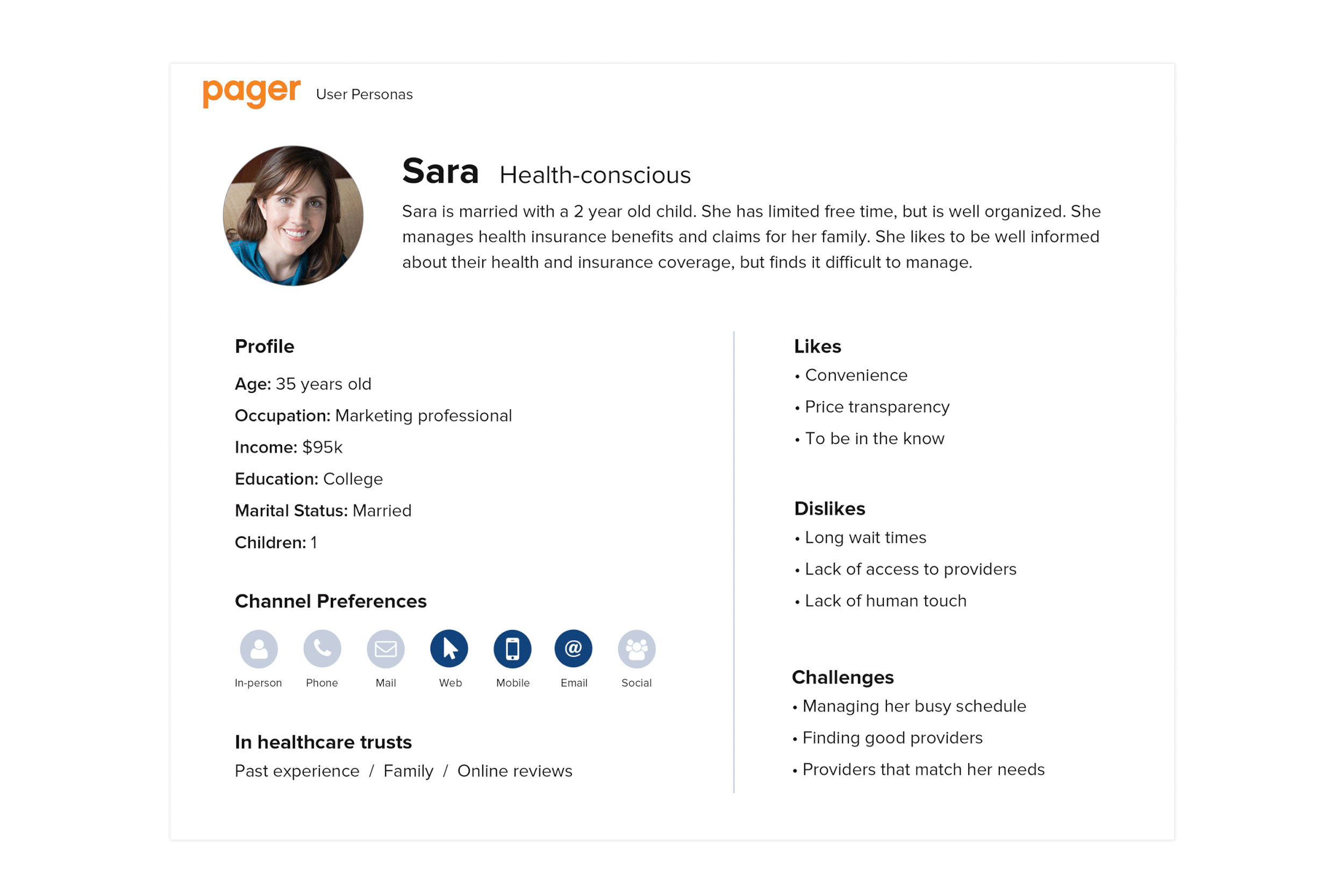
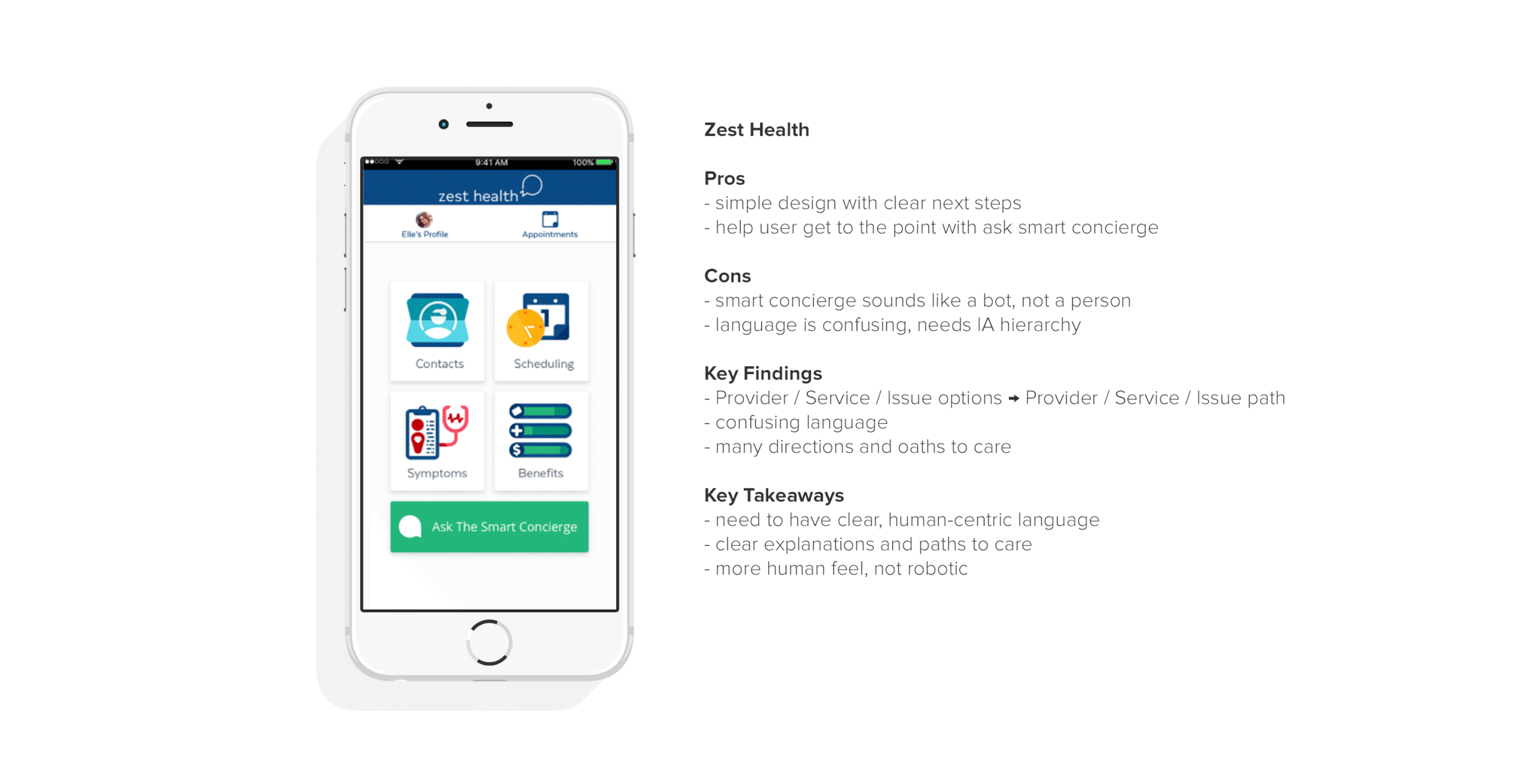
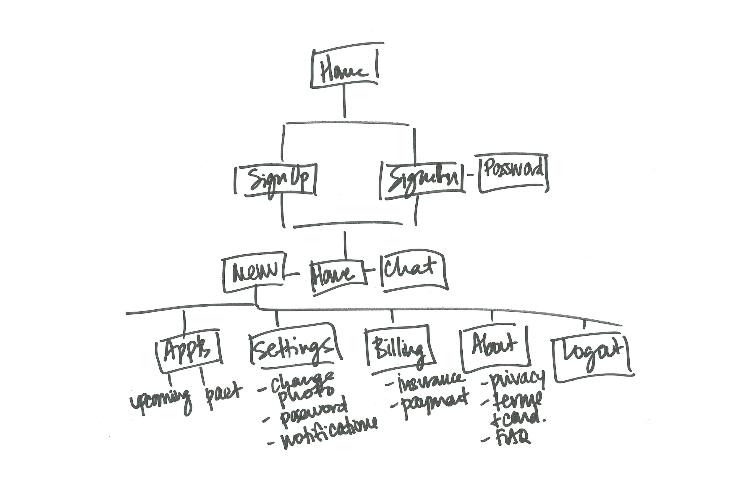
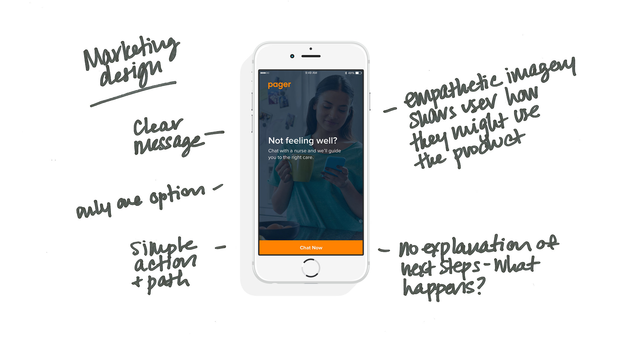
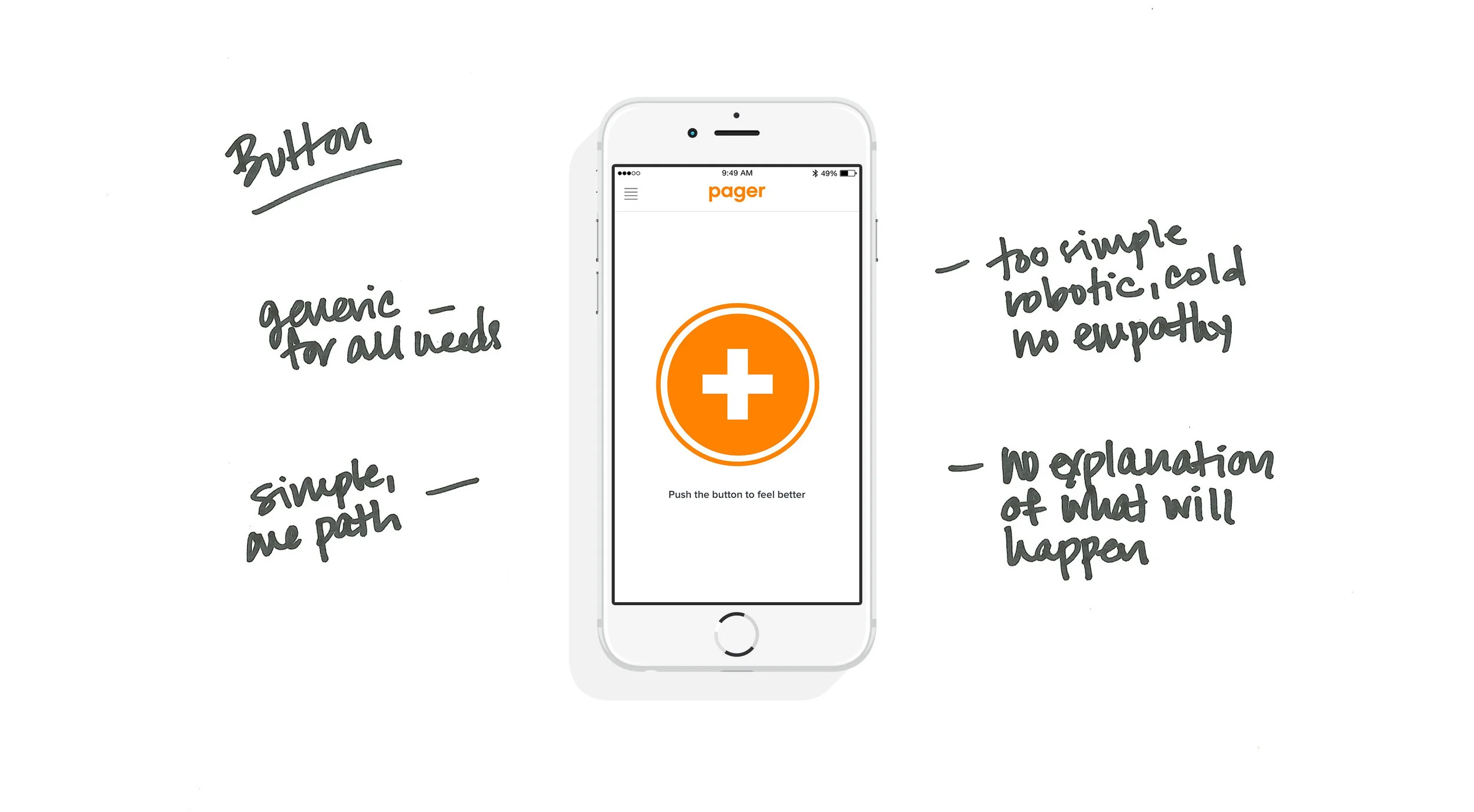
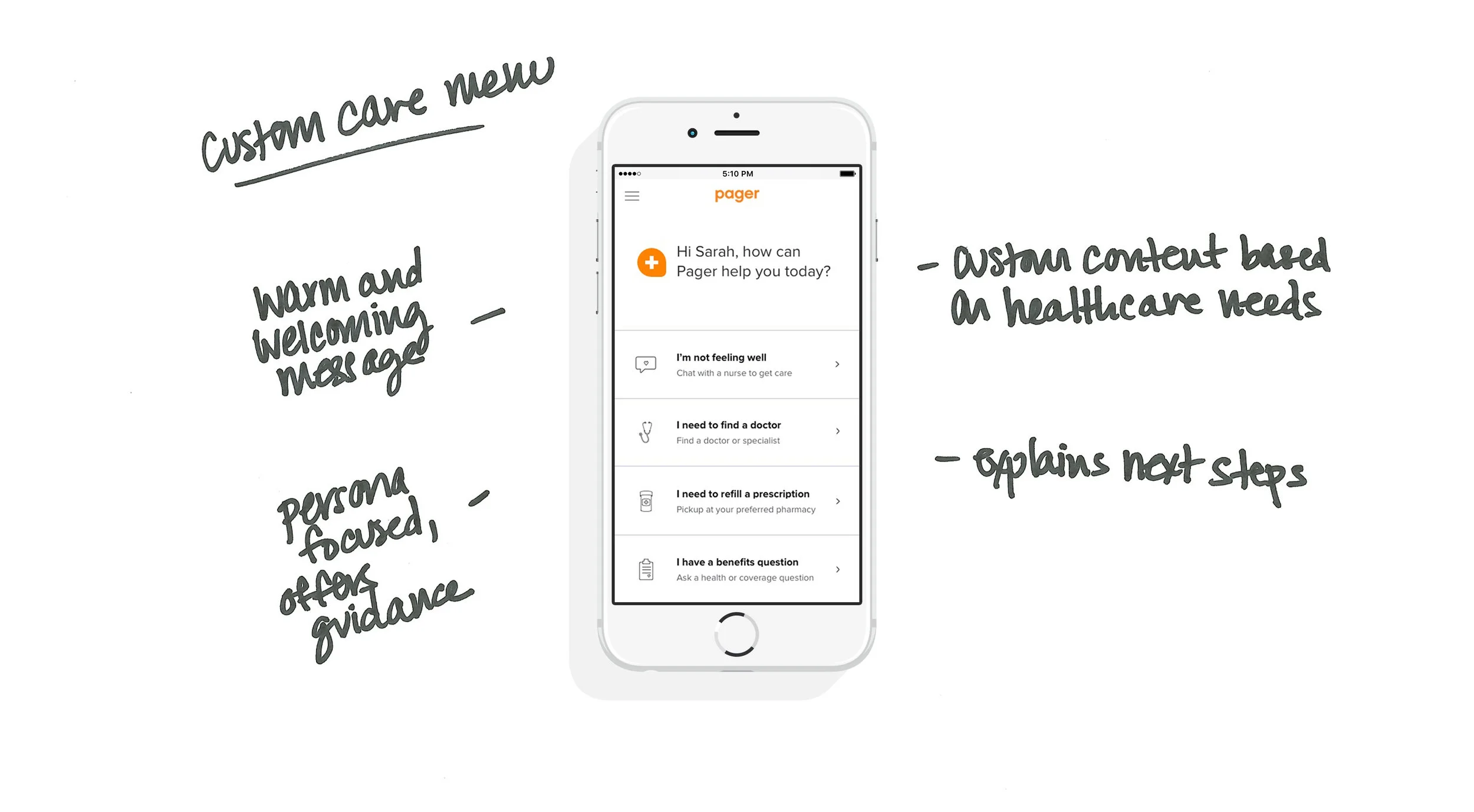
Emily Carter Design
EDC Portfolio Image Pager Website 3000x2000 102517 cover.jpg

Pager App

EDC Portfolio Image Pager Website 3000x2000 102517 1.jpg

Pager App Home Screen
Managed UX/UI, content and production for the Pager app home screen redesign.


The Challenge
Healthcare is complicated. Patients are overwhelmed. They don’t know where to turn and are skeptical that any product will be easy or helpful in their time of need. Pager should provide an easy, accessible and transparent experience to build trust and guide patients to the care they need.


Research
By analyzing our users, competitors, common healthcare use cases and historical data within our product, we were able to better understand user needs and pain points. In turn, this helped us set our priorities to develop a roadmap and comprehensive journey.


User Personas
Everyone has healthcare needs and the way people access and manage those needs varies. Using our most common scenarios, we defined our personas and focused our solutions.

 
EDC-Portfolio-Image-Pager-Website-3000x2000-102517-2.gif


User Journey
We developed a user journey that follows the patient through a familiar healthcare experience. Using our guiding principles and analyzing each stage of the journey, we identified opportunities within this familiar experience.

 
EDC Portfolio Image Pager Website 3000x2000 102517 3.jpg


Competitive Analysis
We conducted a competitive analysis to determine the strengths and weaknesses of the current state of healthcare products and identified pain points and opportunities to see where we can improve on the experience.

 
6-EDC-Portfolio-Image-Pager-Website-3000x2000-102517-COMPETITIVE.gif

What do these products all have in common?
Show information upfront
Clear navigation and care paths
3 out of 5 offer immediate option to chat

What did we want to implement?
Use human-centric, empathetic language that speaks to the user
Greet the user and make them feel welcome
Show information upfront and offer clear paths to care
Offer option to quickly chat and connect with a human
Make sure IA hierarchy reflects care priorities


Wireframes
We wanted to create a clear and easy path to care for our users. Our wireframes helped us prioritize content, demonstrate functionalities and align stakeholders on requirements and execution.

 
3-EDC-Portfolio-Image-Pager-Website-3000x2000-102517-WIREFRAME.gif
 

UX Solution
Previous designs neglected UX functionality. With the new design, we wanted to create a product that integrates research, user and business requirements and offers a flexible design to evolve with future product needs.

 
6 EDC Portfolio Image Pager Website 3000x2000 102517 1.jpg
6 EDC Portfolio Image Pager Website 3000x2000 102517 DESIGN 1.jpg
6 EDC Portfolio Image Pager Website 3000x2000 102517 DESIGN 2.jpg
6 EDC Portfolio Image Pager Website 3000x2000 102517 DESIGN 3.jpg
 

The design fixes two key problems
When the patient enters chat, we have identified their intent and can offer an immediate response, reducing healthcare wait times. The nurse is also managing multiple chats at once and now knows the patient intent upfront and can get to the point and immediately begin triage.


Key Takeaways
Utilize data and research to prioritize IA and content with an emphasis of putting the user first
Focus on UX to create an experience that makes sense for user needs
Use empathetic language that users can easily understand
Make it quick and easy for users to ask questions and access care
Create a design that is flexible and can adjust for future business needs